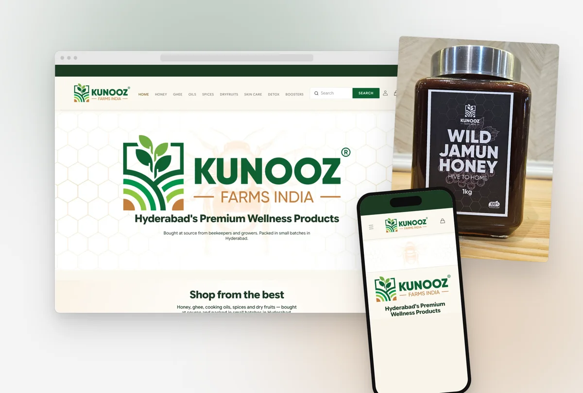
The problem
Kunooz Farms sells honey from twelve regions of India and four other countries, along with ghee, cold-pressed oils, Kashmiri kahwa, dry fruits and skin care oils. It sources in small batches and packs in Hyderabad. It is not a farm and it does not keep bees.
When the founder first came to me there was no brand at all. There was no logo, no guidelines and nothing on the jars, so that’s where I started.
The store came later. A previous agency had set it up on Shopify, and it was live and taking orders while it still had a test product priced at one rupee, lorem ipsum where the farmers’ stories should’ve been, a line from a haircare template on the About page, product photos that didn’t match the products, and a mobile menu that broke into two rows. The founder sent me a list of fifteen problems. When I went through the site properly, I found twenty-three more.
Selling food online is mostly about trust. Someone visiting for the first time has never heard of you, and you’re asking them to buy something they’re going to eat. Every one of those thirty-eight problems was giving them a reason to leave.
What I did
I did the identity first, which meant the logo in several versions, the brand guidelines, and packaging for fifty products across the honey sizes, ghee, oils and Kashmiri goods. After that came the print work, like standees, business cards, a pylon sign and a name board.
On the store it was just me and the founder, working over WhatsApp and a shared sheet. I audited every page and wrote up all thirty-eight issues, each with its root cause and the fix. I rewrote every word on the site, including the policies, the FAQ, the homepage, the About page, the product details and a new gifting page. I restyled the theme to match the brand instead of rebuilding it. Then over the next two weeks the founder and I went through three rounds of fixes covering shipping, photos, product names and links.
Shopify runs the checkout itself, so my part was everything around it. I set up the shipping zones and rates, cash on delivery through Razorpay, the refund terms, and the copy that tells a customer what’s going to happen before they pay.
Key decisions
Restyle the theme, don’t rebuild it
What I choseI went with the layer. It’s one stylesheet of brand tokens that loads last so it always wins, with the colours, type and shapes declared once in the theme head.
The layout and the section order were fine. The real problems were the content and the finish, and a rebuild would’ve taken weeks the founder didn’t have.
Part way through, a theme update wiped about 1,100 lines of customisation that had been written into files the theme owns. After that I moved everything into a file the theme can’t touch, and kept the list of files I’d edited as short as I could.
Copper can’t be used for text
What I choseCopper stays, but only for large marks. For small accent text I used a bronze that measures 5.7 to 1, and I replaced the gradient with the same flat bronze.
The palette came from the logo, so it’s green, copper, forest and cream. But copper on cream measures 3.0 to 1, which fails for body text, and the gold gradient the old site used on its headings measured only 1.95 to 1.
The headings aren’t shiny any more, but you can read them on a phone in daylight.
Near-square, not rounded
What I choseI set a 2 pixel radius everywhere.
I wanted the site to look like the jars.
It didn’t really cost anything. It was a small change, and it made the store feel a lot more serious.
Flat shipping rates that match what the site promises
What I choseI went with flat rates, tested them with real carts to seven cities, and kept the free delivery threshold for Hyderabad.
Every product weight in the store was a placeholder, so weight tiers would’ve quietly undercharged heavy carts. Also, the homepage, the shipping policy and the FAQ were already promising free delivery in Hyderabad.
Until the jars are weighed, a heavy order going to another state ships at slightly under cost.
Take off anything the store can’t prove
What I choseI took the word off the product names, retired the certificates page, and removed every health claim from the copy.
The founder didn’t have a certificate for the products that were called organic, and there was nothing to back up the certificates page either.
The site makes fewer claims now, but it can stand behind every one of them.
The work
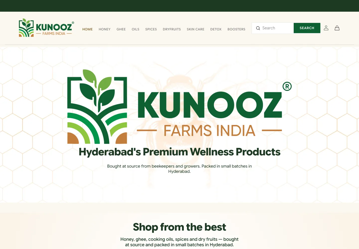


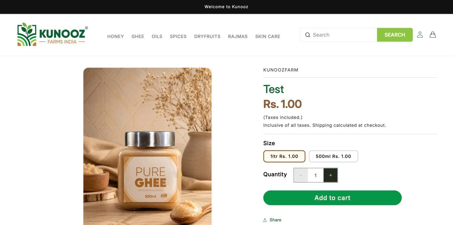
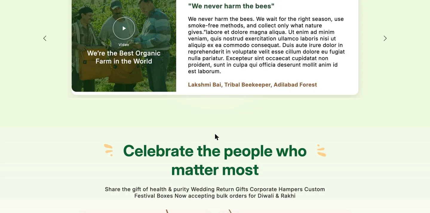
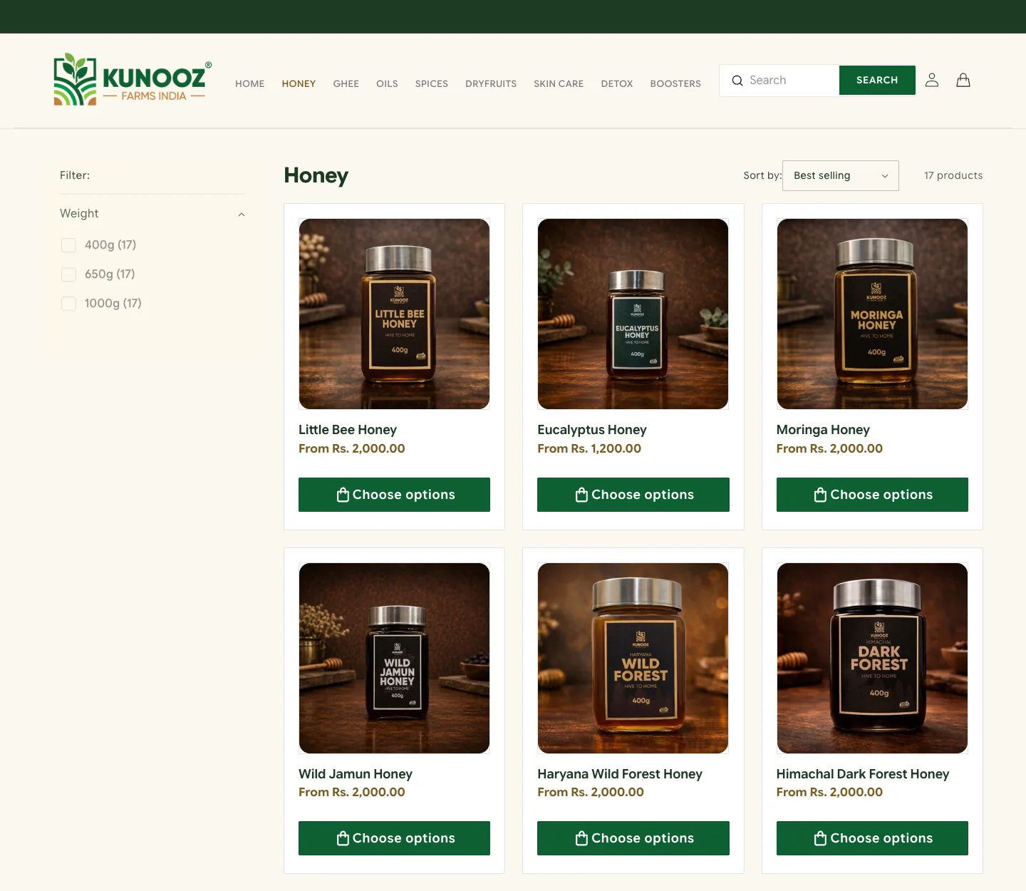
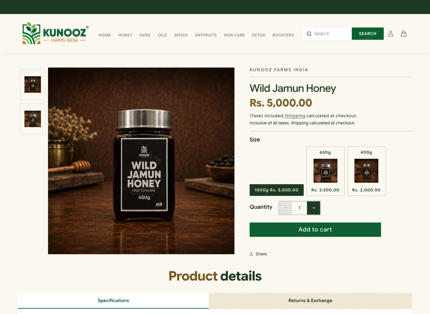
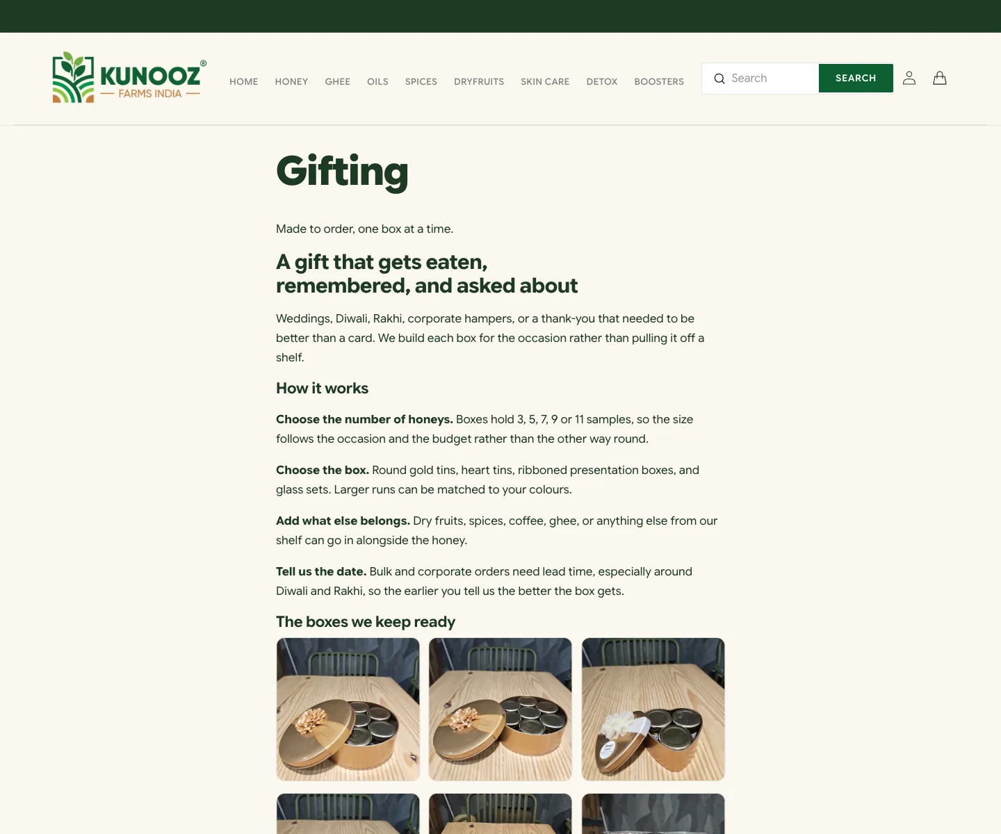
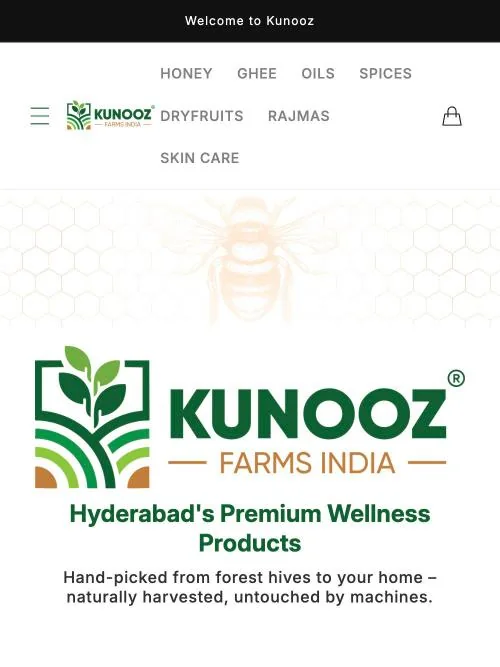
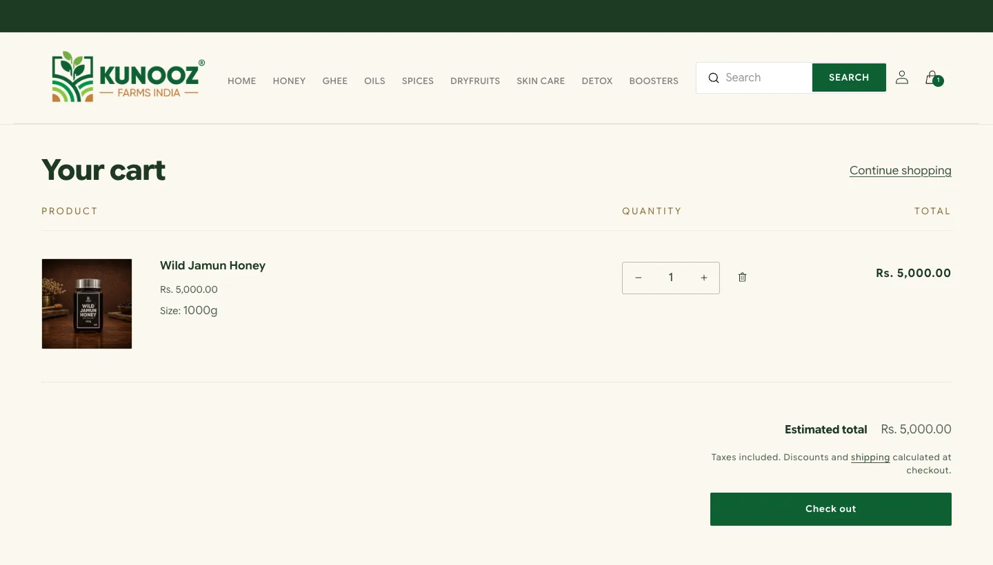
This is the path a customer takes to buy something. They go from the category row to a collection, then to a product with a photo for each size, then to the cart, and finally to a checkout that shows the shipping rate for their postcode and offers cash on delivery.

Evidence
- The founder reported 15 issues and I found 23 more in the audit. All 38 were fixed or retired, and each one has a root cause written down.
- 17 honey products were re-photographed for each size, and I mapped 50 of the 51 variant images and checked them on the live store.
- I tested shipping with real carts to seven destinations, before and after each change.
- I measured the contrast. Copper is 3.0 to 1 and fails, bronze is 5.7 to 1 and passes, and the old gold gradient was 1.95 to 1 and fails.
- I checked every fix on the live storefront, and not just the preview, on the day it went out.
There are no sales figures here. The founder hasn’t shared them, and I wouldn’t print any without his numbers.
Result
The store has been live at kunoozfarms.com since 5 August 2026, and it launched with 68 products in eight categories. Everything it says now is something the business can stand behind.
It’s a small store for a small brand, but the problems were the same kind a big store has.
How I used AI. I directed Claude Code for the theme work and Cowork for the admin side, and I reviewed every change against screenshots of the live store before I let it stay. The decisions were all mine, like what to remove, which colours pass, what the shipping rates are and what the jars are called. When a tool did something I hadn’t asked for, or got a number wrong, I sent it back. They also caught two things I might’ve missed, which were nutrition figures on the packaging that didn’t add up, and a free-shipping setting that quietly blocked checkout for forty minutes.
What I'd change next
First I’d weigh the jars, so shipping can be priced by weight. I’d also brand the checkout, because it still has Shopify’s default look while every page before it looks like Kunooz. I’d like real photographs of the honey instead of renders. And once the founder has a link that works, I’d put his real customer reviews on the homepage.