The problem
I made Timeey for college students who are still figuring out how to manage their own time. I talked to students while I was designing it, and the thing I kept coming back to was that they aren’t lazy. They just struggle to start big assignments, and they need an easy way to get going without more pressure piled on top.
Taking the first step is the hard part. “Write essay” feels overwhelming, but “Outline for 15 minutes” feels doable. The apps students already use don’t help much with that, because the calendar, the to-do list and the timer all live in different places and don’t work together. And most of them lean on red countdowns and streaks that make you feel guilty when you slip.
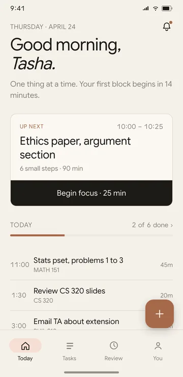
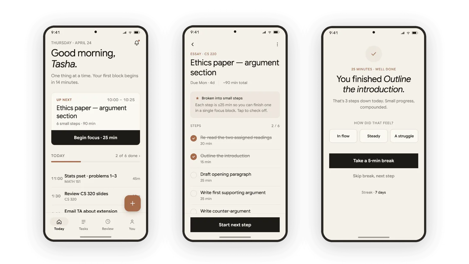
So Timeey brings those things together and keeps them calm. It breaks a big task into steps of 25 minutes or less, it runs a quiet focus timer for each step, and it uses your schedule to remind you when it’s time to leave for class. The tracking is there to show you your habits, and I designed it so it never punishes you.
What I did
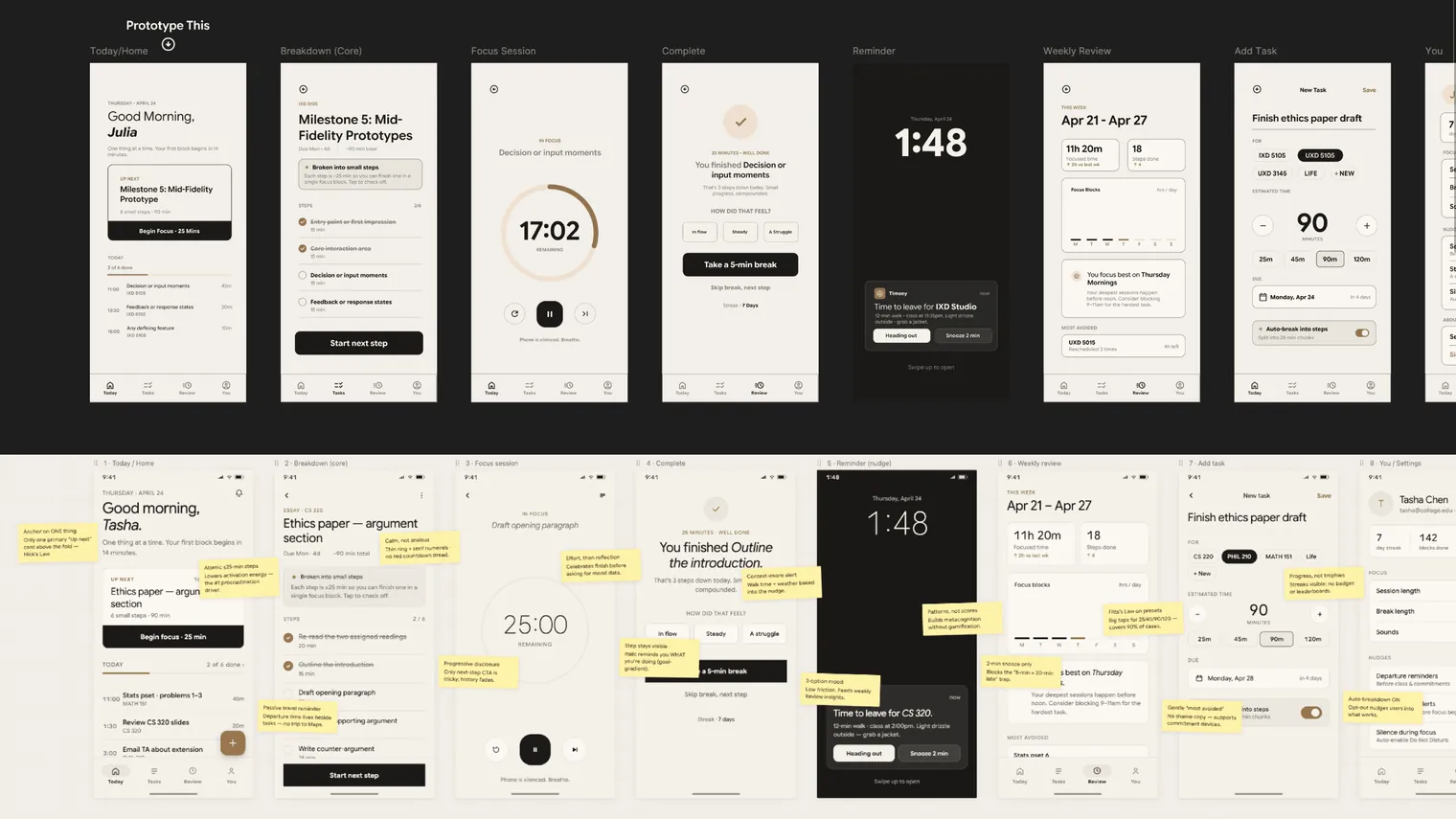
I started in Figma with ten screens, and that’s where the real decisions got made. I worked out what belongs on each screen, what the one main action is, how the type and spacing should feel, the warm paper colour and the three themes. Behind the screens there’s a small component library with colour tokens, a type scale, and buttons, chips, toggles and cards with their states.
A few rules kept it calm while I worked.
- There’s one main thing on every screen, so you’re never deciding what to look at first.
- Tap targets are big and easy, because starting a task should never be fiddly.
- You only see what you need right now, and the rest stays tucked away until you ask for it.
- The language sounds like a person and not a system. It says “Time to head out” and never “Departure alert”.
Then I made it real. I brainstormed with Claude in chat first, and then used Claude Design to turn my static screens into a working prototype. It has screens you can actually tap through, a focus timer that really counts down, theme switching, and sticky notes that explain my thinking on each screen. I steered it the whole way, reviewing what it built, fixing what felt off and pushing on the small details until it felt as calm as I wanted.
The hardest screen was the one the whole app depends on, which is the step breakdown. In Figma I honestly didn’t know how to prototype it or wire it up so it actually worked, and my first prototype just showed a message saying the task had been “broken into 4 steps”. In September 2026 I came back to it and built it properly in code with Claude Code. Now when you save a task, Timeey suggests the steps and you decide what to do with them.
Key decisions
Calm instead of guilt
What I choseI left it out. Timeey has no guilt charts, no badges and no leaderboards, and the weekly review shows you patterns, like when you focus best, and never gives you a score.
The students I designed this for already feel behind. More pressure just adds to a pile that’s already too tall.
I gave up the hooks other apps rely on to pull people back in, and I haven’t tested whether students keep coming back without them.
No step is longer than 25 minutes
What I choseEvery step is 25 minutes or less, so you can finish one in a single focus block. The suggestion screen won’t let a step go past 25 either.
What stops people is the size of the first step. If the step is small enough, starting stops being scary.
A long task turns into a long list, and some work doesn’t split neatly into 25 minute pieces.
One main action on every screen
What I choseEach screen has one main action. On Today, “Up next” is the only primary card you see before you scroll.
It’s Hick’s Law. The fewer choices you’re looking at, the faster you pick one, and a student who’s already avoiding work doesn’t need another decision to make.
Anything secondary is a tap or two further away.
The AI suggests, the student decides
What I choseIt shows you the steps and says clearly that they’re only suggestions. You can rename, retime, reorder or delete any of them, add your own, or throw the list away and write your own from scratch. If the task is too vague, like “study”, it asks one question before it suggests anything.
The way I pictured it from the start, the AI breaks the task down and suggests the steps, and the student can use them or make their own. A plan you didn’t agree to is one more thing to avoid.
There’s one more screen between saving a task and starting it.
The work
The best way to see the work is to use it. The prototype at the top of this page has all eleven screens, and these buttons jump straight to the ones that matter most.
Evidence
- The prototype has 11 screens you can tap through, a focus timer that really counts down, and 3 themes.
- The Figma file has a component library behind it, with colour tokens, a type scale, and buttons in three styles, three sizes and two states.
- The suggested steps screen passes 26 scripted checks that I can re-run after any change. They cover clear tasks, vague tasks, editing, deleting with undo, writing your own steps, and the 25 minute limit. An axe accessibility run on its five states found no violations. I ran both on my machine on 17 September 2026.
- While I was designing it I showed it to somewhere between five and ten students. They told me it felt intuitive, and that they’d love to use something like the step breakdown.
Those were casual conversations and not a usability test, so nothing here counts as a finding. Nobody has tested the suggested steps screen yet. The suggestions are also scripted, which means I don’t know yet how good a real AI model’s steps would be.
Result
Timeey is a design project with a working prototype, and I think it’s real enough now to put in front of people and get honest reactions to how it feels, and not only how it looks. It also gave me a point of view I can defend, which is that calm design without shame makes it easier to start.
How I used AI. AI shows up in two different ways here, and I want to keep them apart. The first is how I built it. I designed the screens myself in Figma, used Gemini for research and to check the UX laws I was leaning on, brainstormed with Claude in chat, used Claude Design to make the prototype work, and later used Claude Code to build the suggested steps screen. The second is the AI inside the product. The step suggestion is an AI feature that I designed, including what happens when it’s wrong or doesn’t have enough to go on. In this prototype it’s scripted, so it shows the interaction design and isn’t a working AI feature.
What I'd change next
I’d get it in front of real students much earlier, instead of polishing screens first. I’d start with the suggested steps screen, because I want to know if students understand that the steps are only suggestions and whether they actually edit them. After that I’d connect a real language model and find out if its steps are any good. The weekly review screen still tries to do too much, and the app is missing some basics that most time management apps already have.