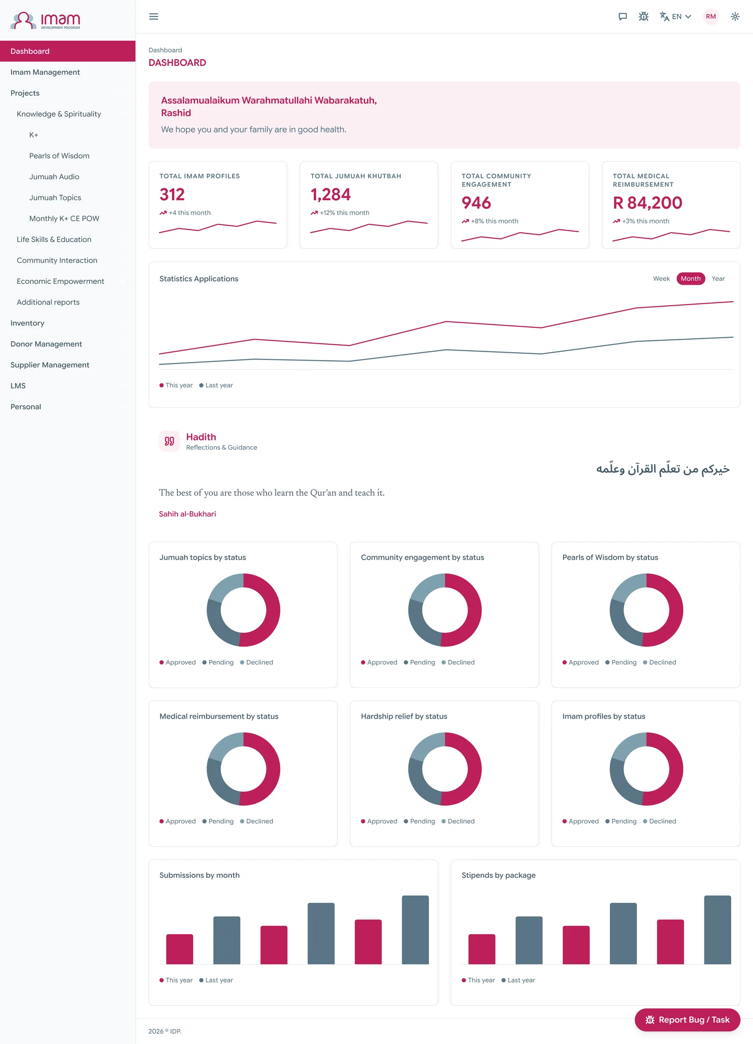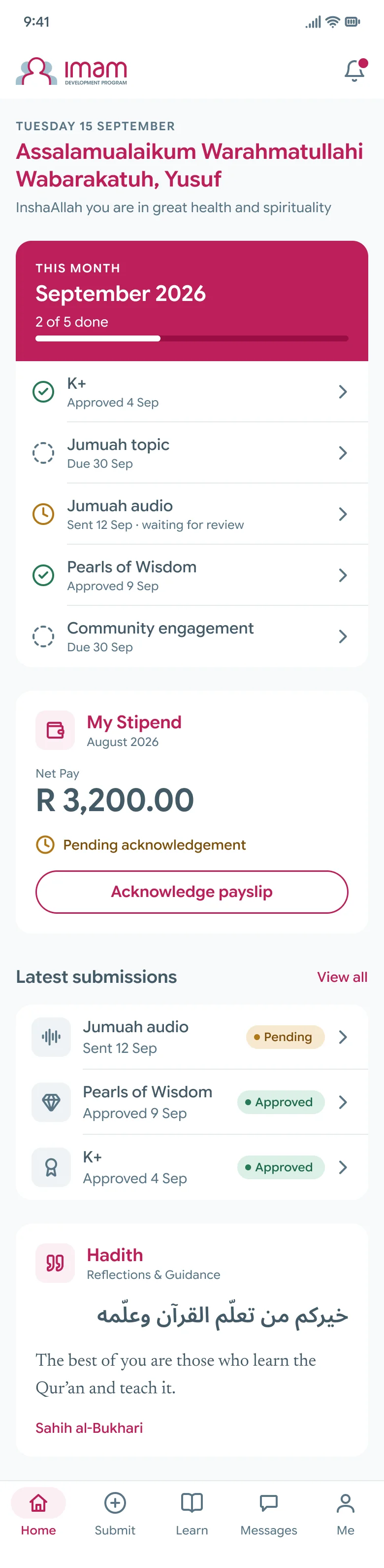
The problem
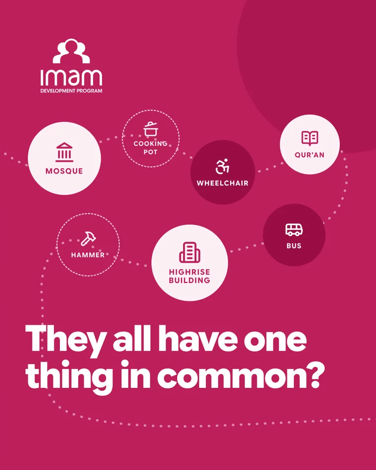
IDP supports imams in 18 countries, and I’m its only designer. For a long time the brand existed as a logo, a few colours and a folder of past work. A brand guideline can tell you what the colours are, but it doesn’t help anyone build anything, so every new piece started from a blank page and small things drifted. A pink that’s slightly off. Spacing that changes from page to page. A button that looks different everywhere it shows up.
The cost landed on two teams. The fundraising manager makes the LaunchGood campaign images and the material that goes to donors. The marketing manager makes the social posts. Each of those was built from scratch, and the bigger pieces, the impact reports, donor proposals and newsletters, took months to finalise and release.
The developers are an outside team, and before the system they had nothing to work from but the logo and a few colour values. They matched the rest by eye. That’s why the website, IDP’s Instagram, the fundraising pages and the impact reports all looked like slightly different organisations.
You could measure the drift on the public website. On 11 September 2026 I audited six of its pages with axe-core, at desktop and phone widths. It found 14 pieces of text that fail contrast, some as low as 2.24 to 1 where the minimum is 4.5, 54 images with no alt text, and 26 scrolling areas you can’t reach with a keyboard. The home page alone used three button styles, two link colours and two type families with no real scale.
Automated checks only catch some accessibility problems. The numbers above are counts from those six pages on that date.
What I did
Before I built anything, I audited the pages and templates IDP already had. I talked to the marketing manager and the fundraising manager about what they publish and what slowed them down, and I worked out with the developers where handoff was slow, which came down to guessing values that were never written down. I wrote IDP’s 2025 brand guidelines first, and the system follows them.
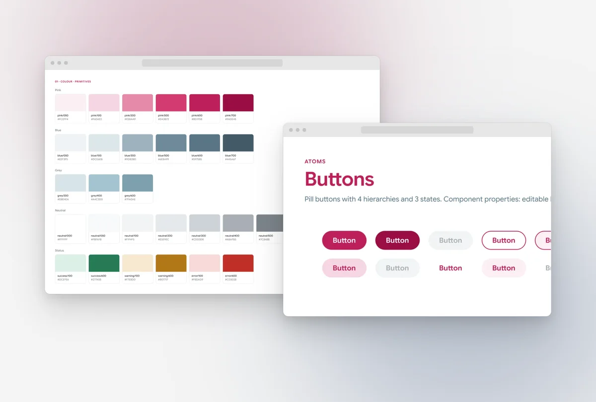
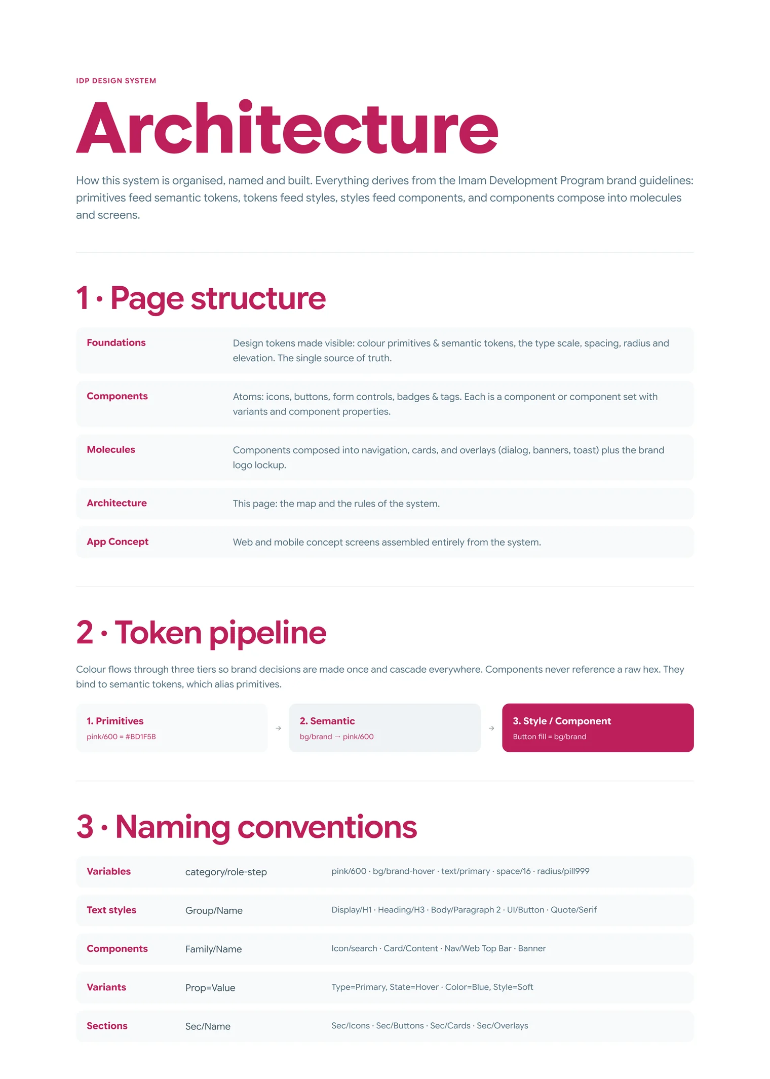
Then I built the system in Figma. I wanted the brand to be decided once, so that everything else inherits it. The colours work in layers. At the bottom are the raw colours, IDP’s pink, blue and grey, each stretched into a full range from light to dark. On top of those sit semantic tokens that describe a job instead of a colour, like bg/brand, text/title or border/focus. Components use the job, so if IDP ever changes its pink, I change it in one place and every button, badge and card follows.
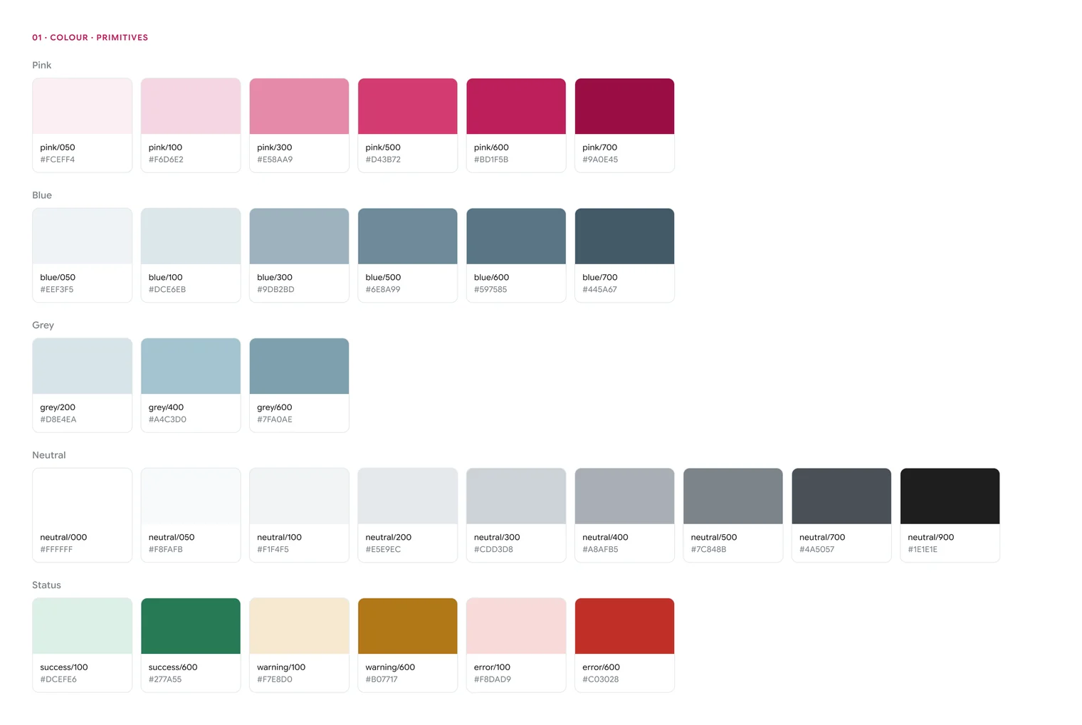
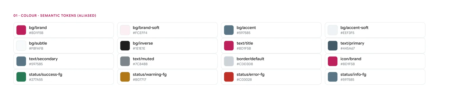
Spacing, corner radius, type sizes and elevation work the same way. In total the file has 151 variables in nine collections. 98 belong to the shared system, and the other 53 are the layer I added later for the Imam Portal apps.
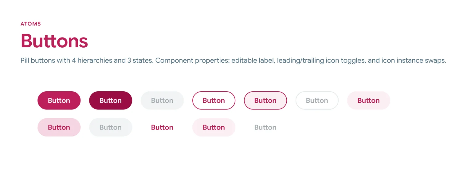
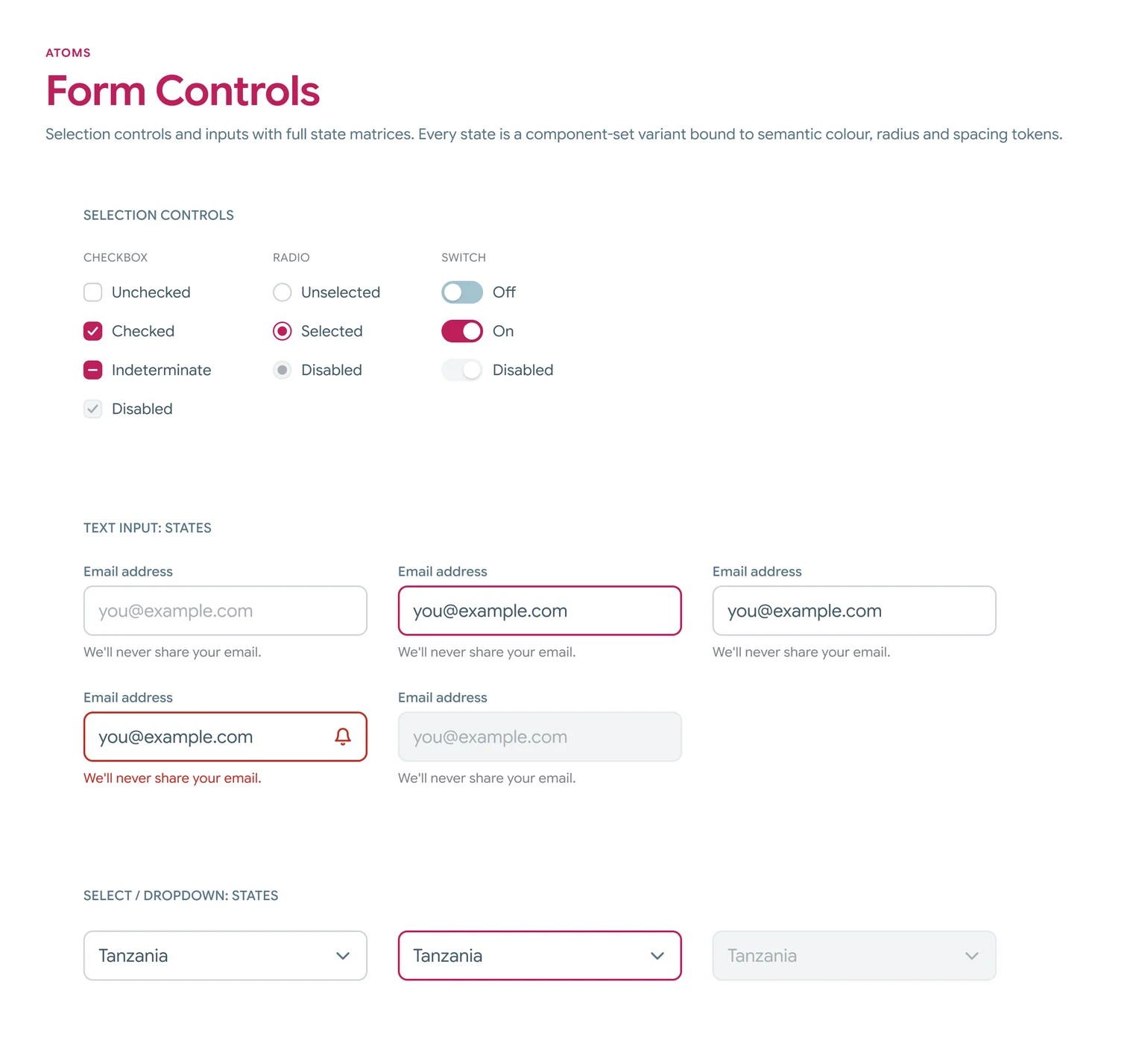
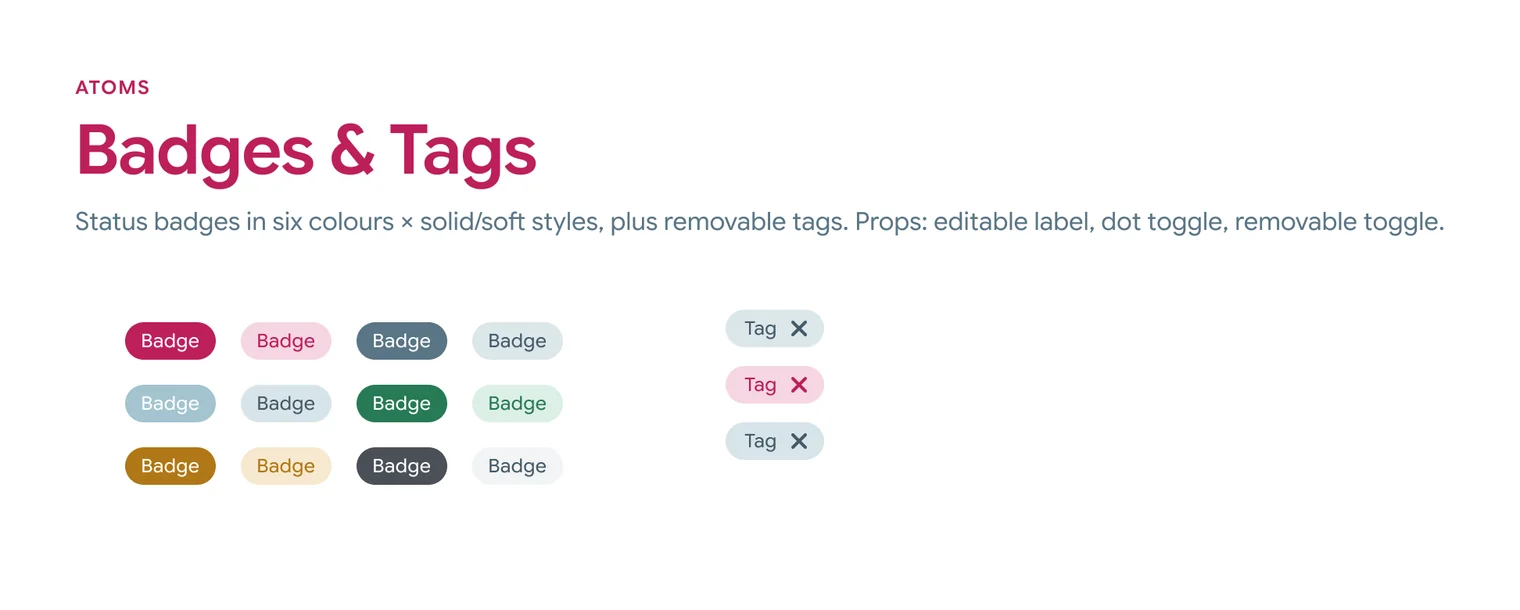
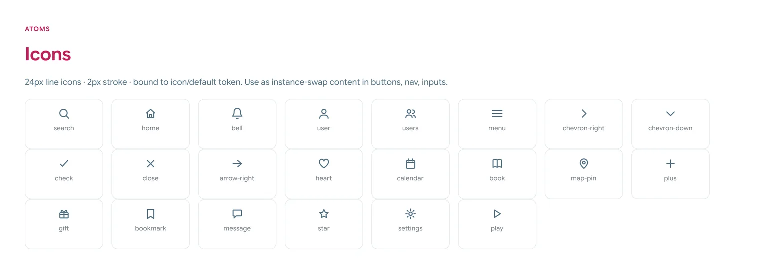
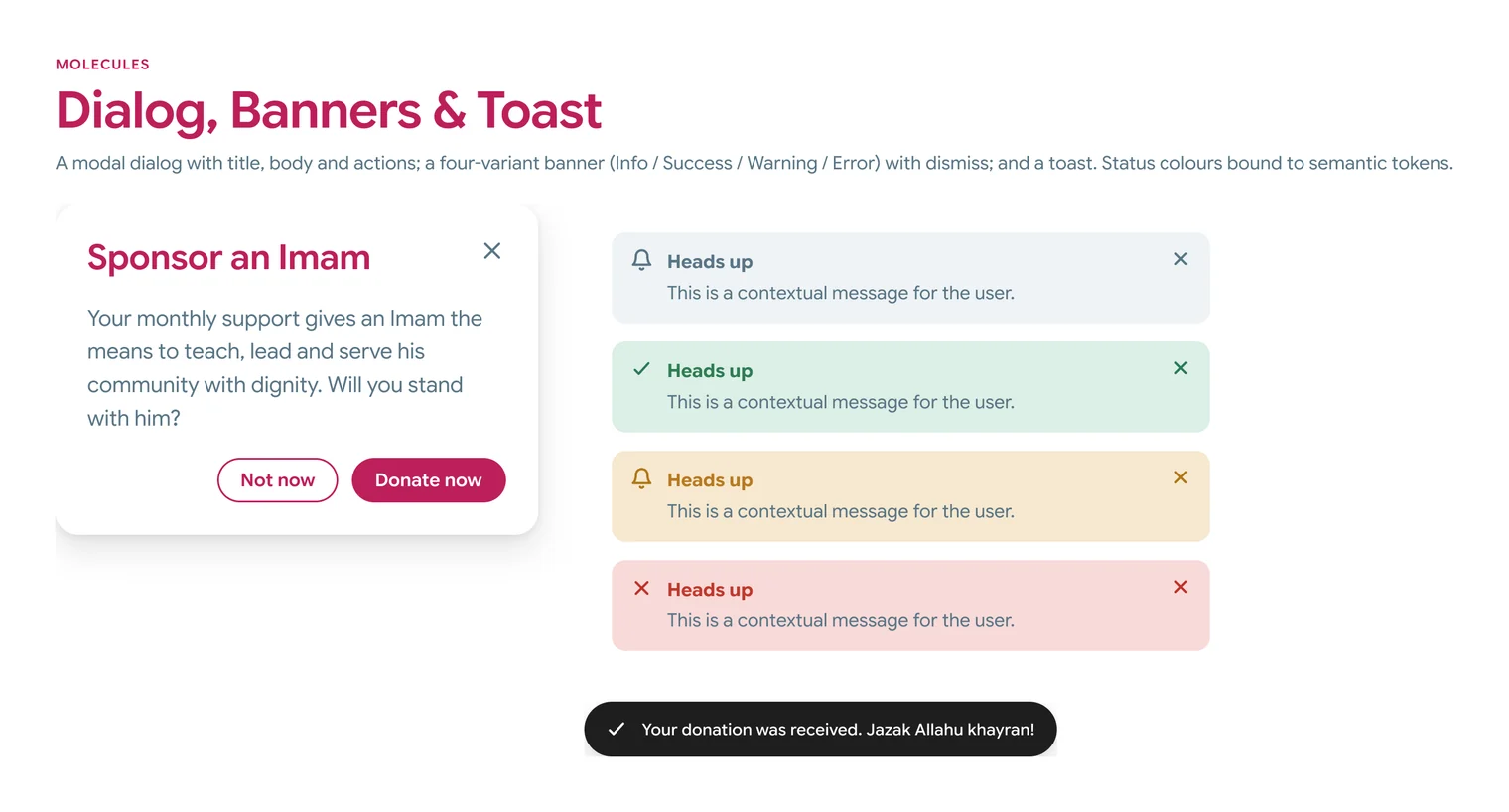
The components come in two levels. The small pieces are 22 icons, buttons in four levels of importance, checkboxes, radios, switches, text fields, dropdowns, badges and tags, each with every state already drawn. The bigger pieces are built out of those: the logo lockup, the web and mobile navigation, three kinds of card, a dialog, banners and a toast. One button component covers every type and state, so there aren’t a dozen near-identical copies to keep in step.
For the two managers I made 20+ templates for the pieces the team makes most: campaign images, social posts, and the report and newsletter formats. A campaign image now starts from something that’s already on brand, and the manager changes the photo, the words and the number.
For the developers, the tokens leave Figma in the formats they asked for. They get the file itself with Dev Mode, so a colour clicked on a screen shows its token name and not a hex code, plus a CSS export and a JSON file. A colour in the file is now the same colour on the site.
I also wrote a page inside the file that explains how the whole thing is organised: what each page is for, how a colour travels from a raw value to a token to a component, and how everything is named. I did that so someone else could pick the system up and extend it without having to guess.
See the Imam Portal, the web and phone apps I designed on this system
Key decisions
Name colours for the job they do
What I choseI added the layer in between. A button’s fill is bg/brand, and bg/brand points at pink/600.
A brand change then happens in one place, and a developer reading the file sees what a colour is for and not only what it looks like.
There’s more to set up and a naming system everyone has to learn. That’s a big part of why I wrote the documentation page.
Draw every state once, inside the component
What I choseI drew them inside the components. Every state is a variant, so it can be picked but it can’t be restyled.
The old site had three different button styles on a single page. If the states already exist in the component, nobody has to invent their own.
There are more variants to maintain, and I’m not done. The shared buttons still don’t have a focus state drawn.
One serif, and only for hadith and quotes
What I choseEverything is set in one sans serif. The serif is kept for hadith and quotes, and nothing else.
Some of IDP’s content carries religious weight, and I wanted it to have its own voice without making every page feel heavy.
The site leans on one typeface for almost everything, so there’s less variety in the type. The serif’s licence also only covers the web, so a native app would need its own.
Keep three failing tokens for now, and fence them off
What I choseI left them in the shared system and banned them from the apps. My handoff names each one and says what to use in its place.
The new website’s stylesheet is generated from the shared pages, and the site already uses those tokens. If I changed them now, the design file and the code would stop matching.
The failing values are still sitting in the shared system until the website itself can change.
Templates for the team, not pieces from me
What I choseTemplates. The fundraising manager and the marketing manager make their own pieces on the system now.
It sped the designs up, and it freed me for the design-heavy work.
Nothing so far.
The work
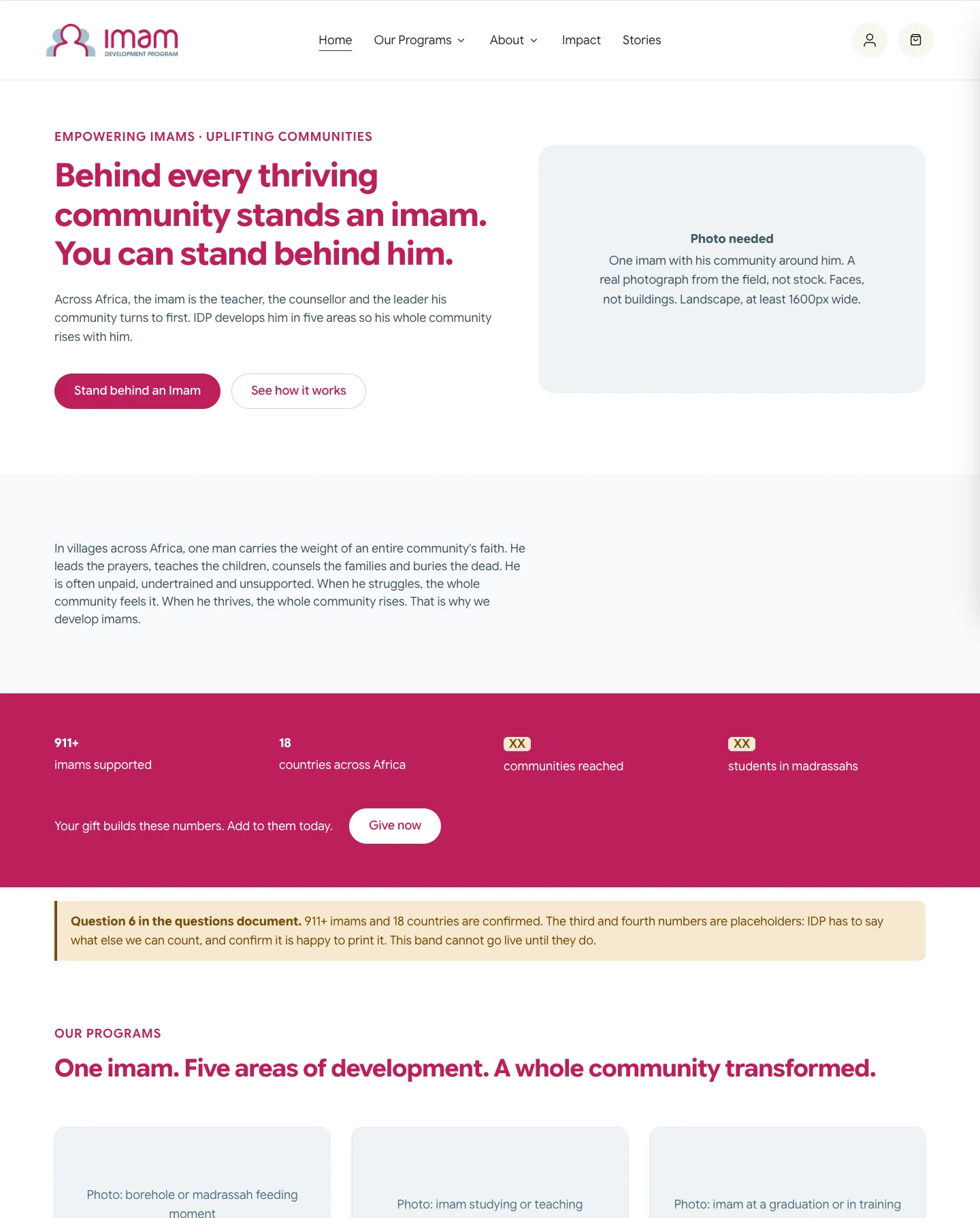
Before the system: the donation flow
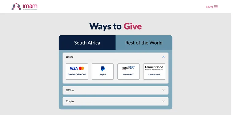
The first thing I changed on IDP’s website, two years before the system existed, was how people give. The old donate page was a page of its own. You picked a region, South Africa or the rest of the world, then a way to pay from a row of logos, and then you left for the payment provider, all before you had seen an amount.
I mapped the flow and decided what goes where, and one developer built it. Now Donate opens a single window on whatever page you’re on. Give once or monthly, pick a programme, pick an amount or type one, and the next step is payment. It went live in spring 2024 and it’s still the flow on imamdp.org today.
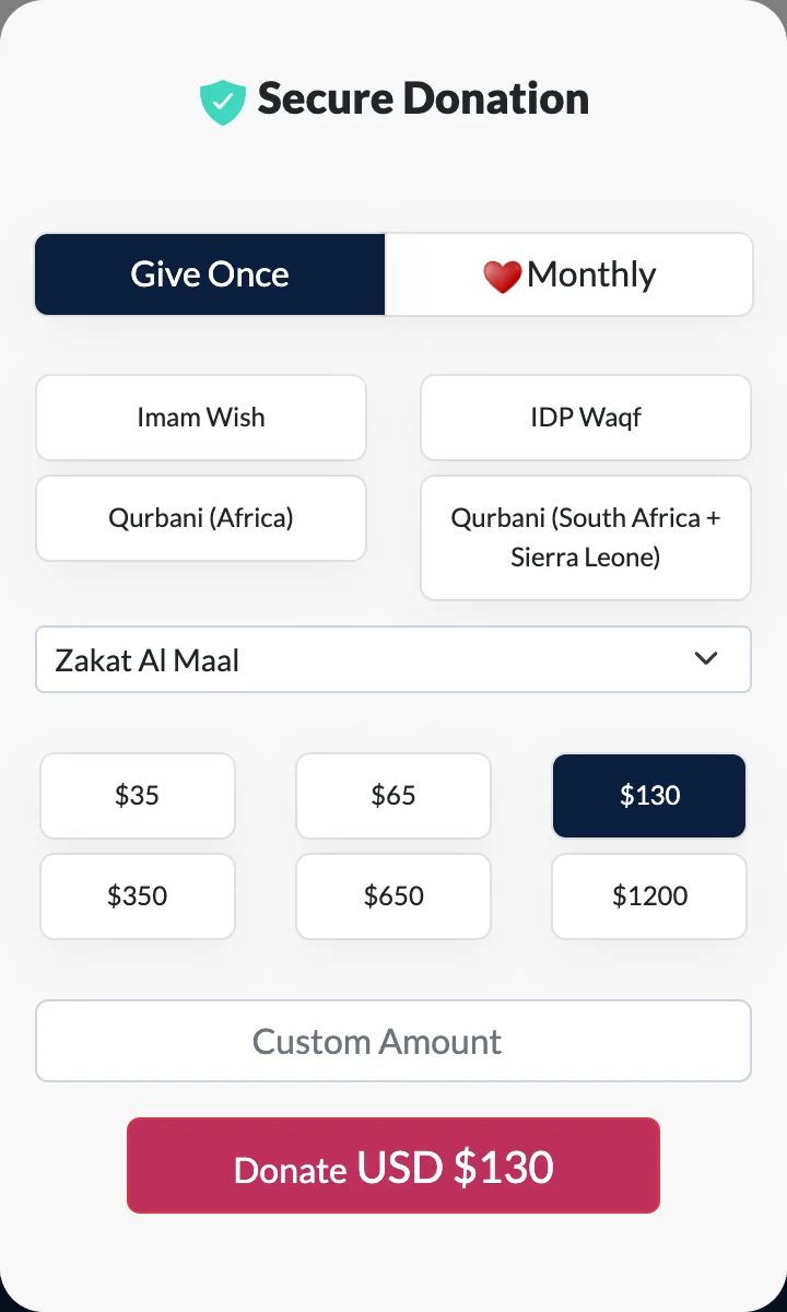
There’s no Figma file or wireframe from this one. I worked it out directly with the developer, so the record is the flow itself. We watched how long a typical donation took and how often checkout was abandoned, and both improved. I don’t have those figures to hand, so there’s no number on this page.
Screenshots from the Wayback Machine (3 March 2024) and the live site (18 September 2026). The window’s left panel, a campaign photo of children, is cropped out on purpose.
Evidence
- The fundraising manager and the marketing manager make their own campaign images and social posts on the system. Before it, each one was built from scratch.
- Impact reports, donor proposals, newsletters and fundraising pieces used to take months to finalise and release. With the system they take a day or two. That’s what I’ve seen in my own work at IDP, and nobody has measured it.
- The developers work from the Figma file in Dev Mode, a CSS export and a JSON file, instead of matching colours by eye.
- The shared system has 9 component sets with 53 variants, 22 icons, and 8 bigger components such as the navigation, the cards, the dialog and the toast. The app layer for the Imam Portal adds 28 component sets, 188 variants and 76 icons.
- There are 151 variables in nine collections: 31 primitives, 35 semantic tokens, 12 spacing steps, 7 radius steps and 13 type tokens in the shared system.
- On the current site’s home page, axe flagged 67 elements at desktop width and 85 at phone width. On the new home page it flagged 20 at both widths, using the same script and the same rules.
- Across the old pages, 54 images had no alt text and 26 scrolling areas couldn’t be reached by keyboard. On the new home page those numbers are 1 and 0.
- The 6 contrast failures left on the new home page are all one pair of colours, at 4.35 to 1 where 4.5 is needed, on the temporary photo labels.
The new website isn’t finished or live, so the after numbers are a checkpoint and not a final result. I haven’t sat with the managers and watched them use the templates, and nothing on this page is a measurement of their time.
Result
The brand went from a folder of flat files to a working kit that three teams use. The fundraising and marketing managers publish from the templates. The developers build from the tokens. The same system now covers the new website and the Imam Portal, on the web and on a phone.
Who did what. I audited, interviewed, designed and documented the system, and I made the templates. The marketing manager and the fundraising manager told me what they publish and what slowed them down, and they make their own pieces on it now. The outside developers told me what formats they could build from, and they’re implementing it.
How I used AI. I used AI to help me build the app components and foundations in Figma. The two audits on this page were run with a script that Claude Code wrote for me around axe-core.
What I'd change next
First, sit with the two managers and watch them use the templates, because so far I only know what they’ve told me. Then fix the three failing tokens at the source once the website can take the change. A few components still point straight at a raw colour instead of a semantic token, the shared buttons need a focus state, and the error field needs the right icon. After the website launches, I’ll run the same audit again so the before and after are measured the same way.