The problem
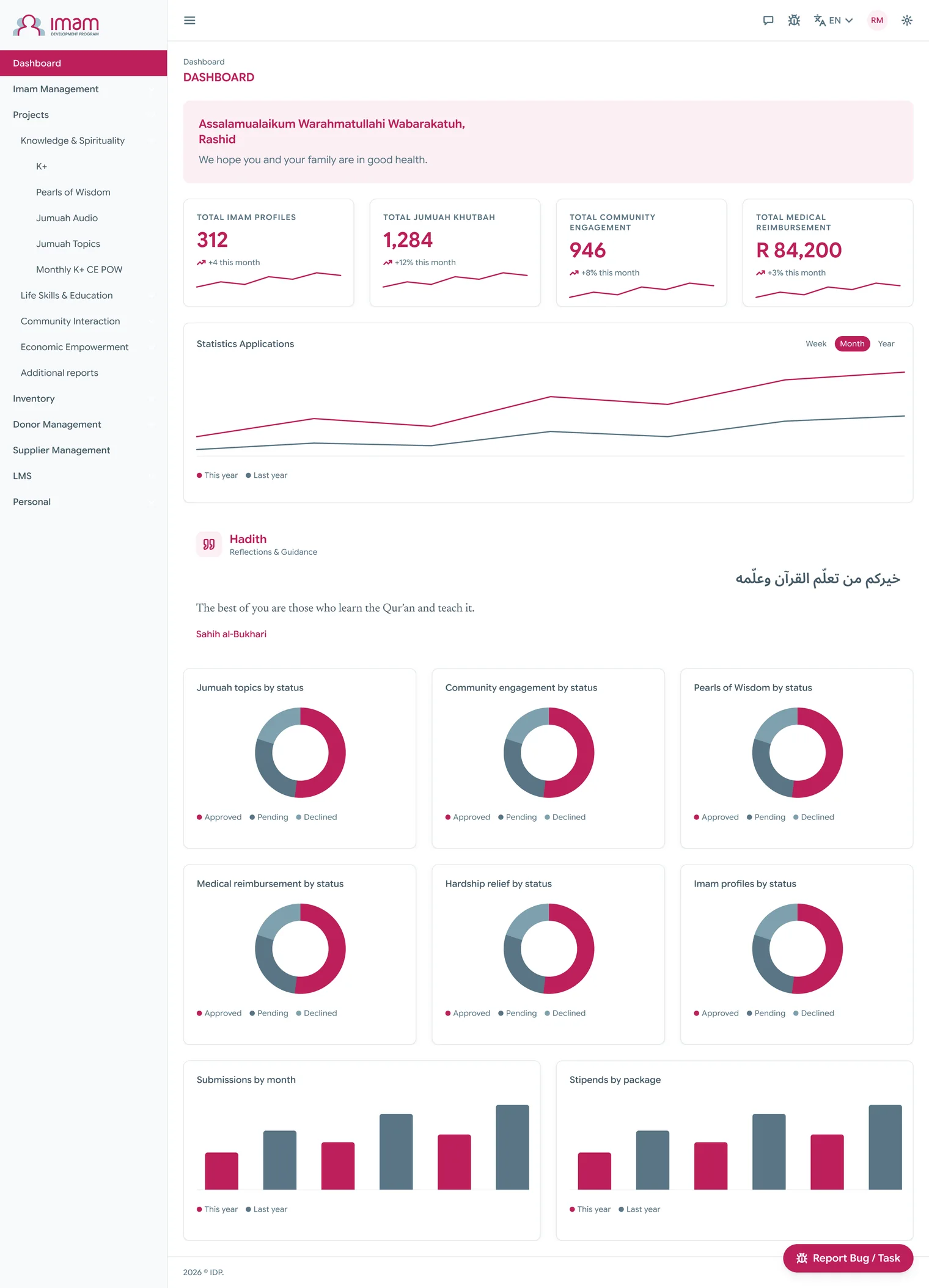
The portal is a web app that an outside team of developers built on Bootstrap 5, and it works. But it wasn’t on IDP’s design system, some of the theme’s template wording was still showing, and there was no phone app at all.
An imam’s stipend depends on three things he submits through the portal every month: his K+ test, his community engagement and his Pearls of Wisdom. The compliance report ties all three to what he gets paid, but the imam himself had no way to see where he stood. Staff had the opposite problem. Everything they needed to approve was already in the system, it just wasn’t shown to them as a list of things waiting.
The phone app matters because nobody who uses the portal sits at a desk for it. An imam should be able to send in everything he owes from the phone in his hand. Staff need to check how each imam is doing, his tests and his submissions, and eventually release his stipend from the same place. Later on, a donor will be able to fund an imam directly. For this phase I focused on imams first, plus whatever staff need while they’re out.
Two things shaped every decision I made. The developers are on Bootstrap 5, so whatever I designed had to arrive as a theme they could apply, because a rewrite was never on the table. And the portal already runs in English, Arabic, Swahili and Chichewa, so I couldn’t assume short English strings or a left to right layout anywhere.
What I did
I started by learning the product from the inside. I went through the whole portal on my own login, and wherever my login was refused, which turned out to be thirty five routes, I read the developers’ code and translation files to work out what each screen held. Any screen I designed from the code, without having seen it, says so right on the frame.
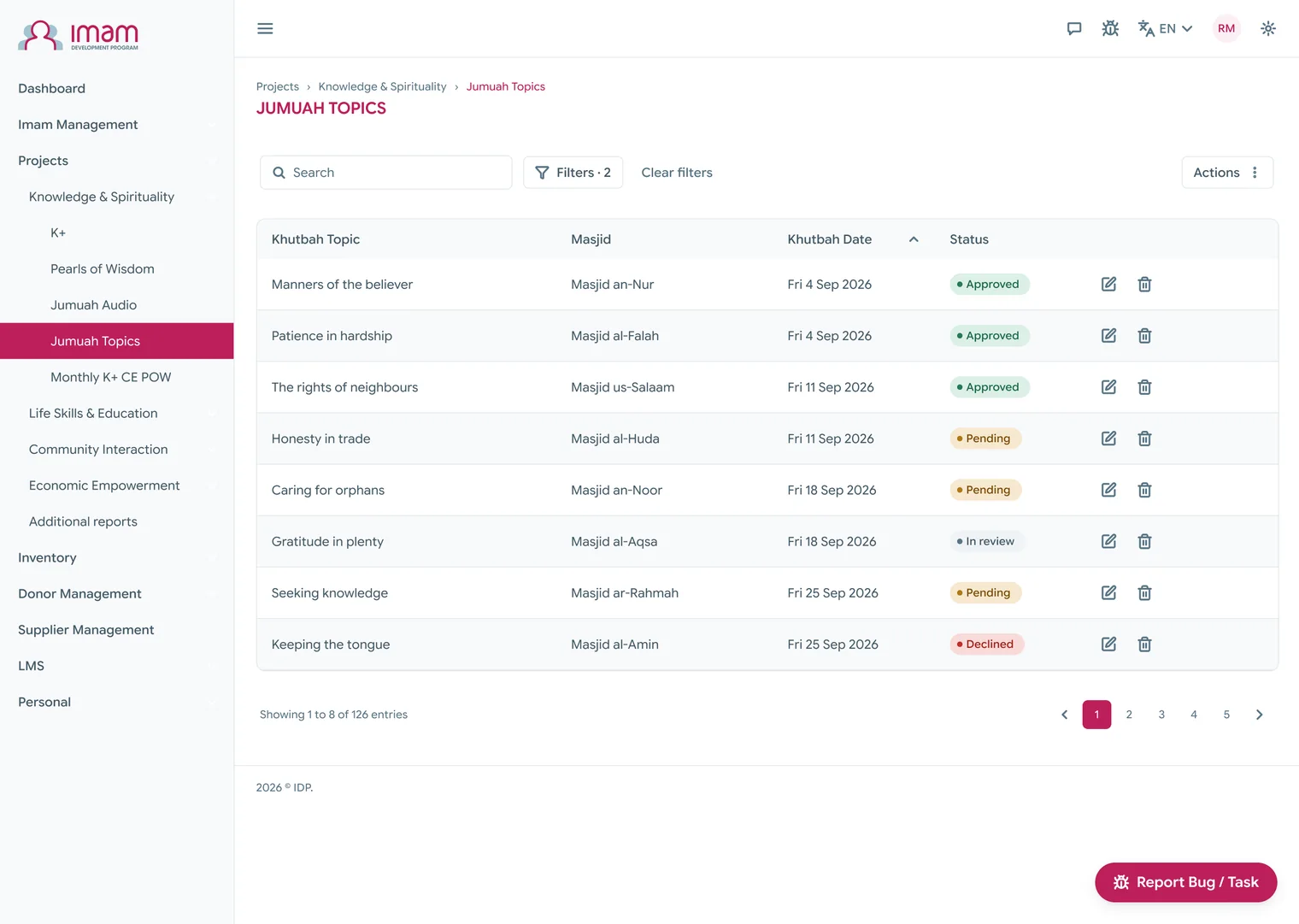
Then I redrew the web app without moving anything. Fifteen templates cover every route the portal has, and the routes, the features and their order are all exactly where they were. Apart from the look, the only thing I touched was wording and titles where the template text was showing. That way the developers can ship it as a theme.
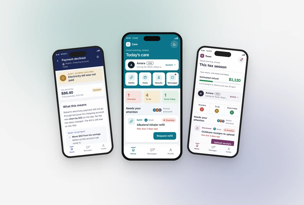
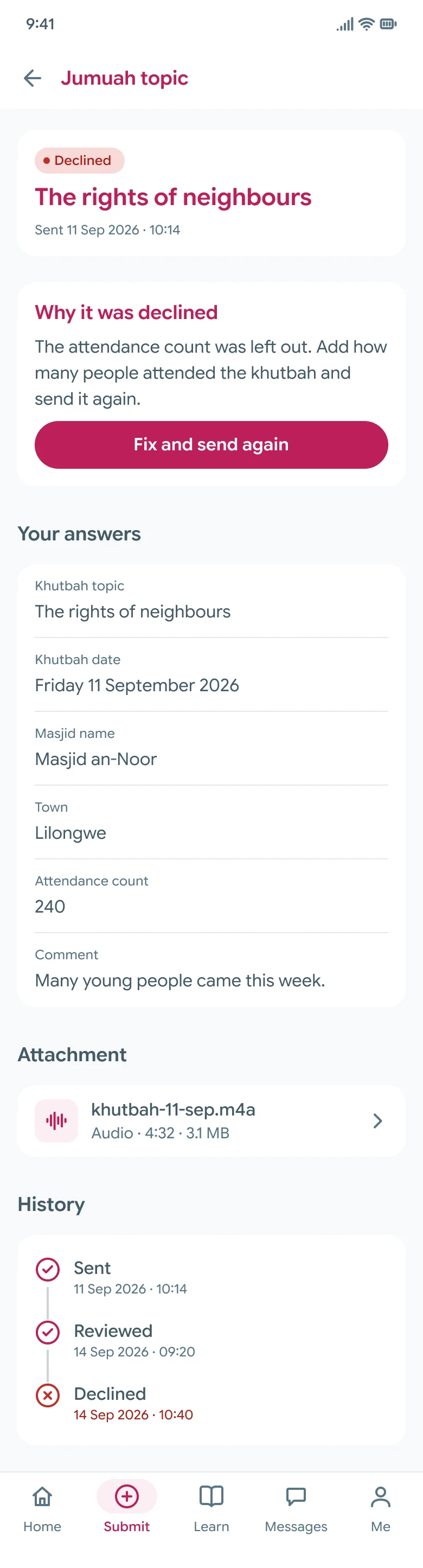
The phone app is the new part, and it came to sixty eight screens in twelve sections. The Jumuah topic form and the eighteen other things an imam can send all share one shell, and the forty three report tables from the web turn into cards, one per row. Donors, inventory, stipend management, the LMS admin and the lookups stay on the web for now. I drew one design at 390 wide that doesn’t lean on iOS or Android, so it works whether the developers ship a native app or a web app you can install. There are two sets of five tabs, and the app picks the set based on who signs in.
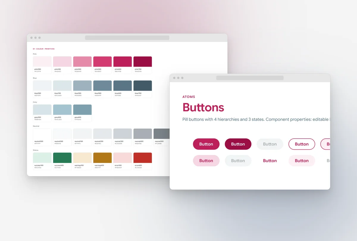
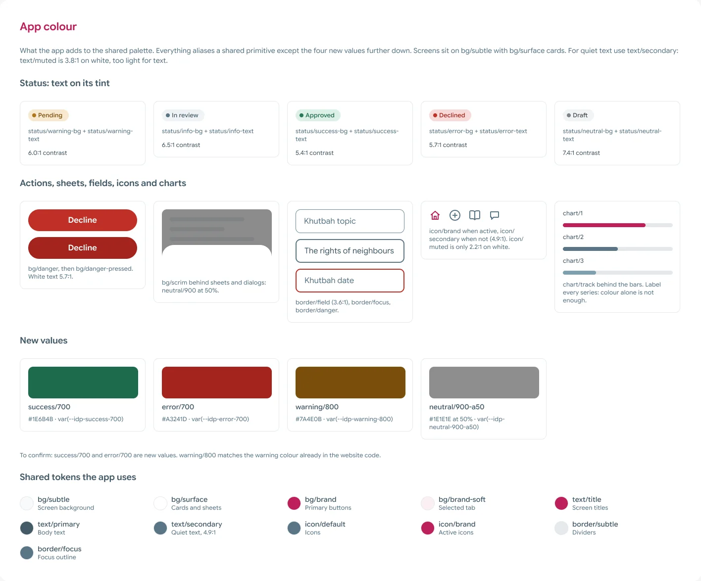
All of it is built on the design system, which for the app means 28 component sets, 188 variants and 76 icons. Every value on every screen is a variable, so when a developer clicks a colour in Dev Mode they get a token name and never a hex code. The app’s tokens live next to the website’s under their own names, because the website’s stylesheet is generated from the shared pages and I can’t change anything on those.
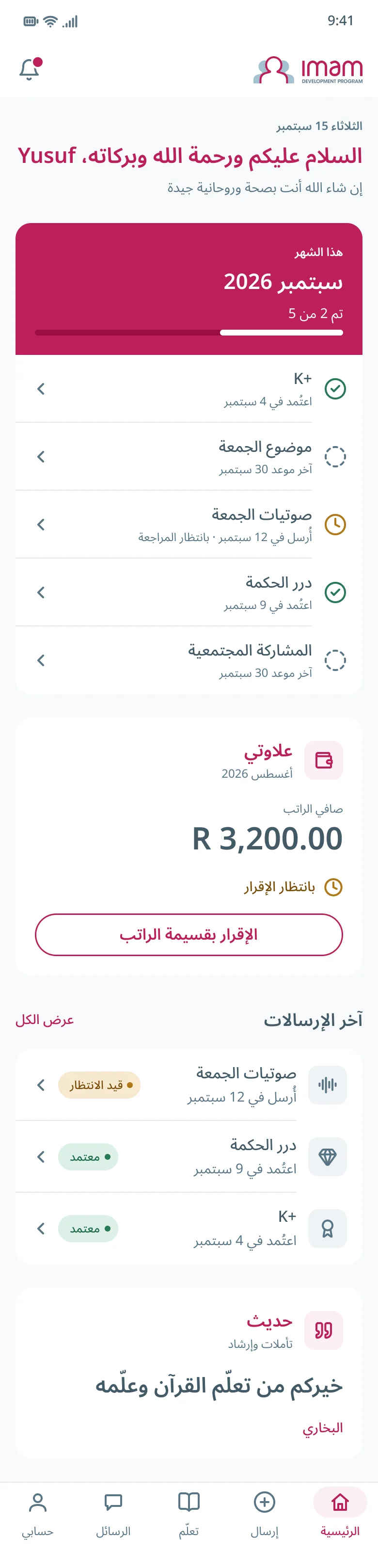
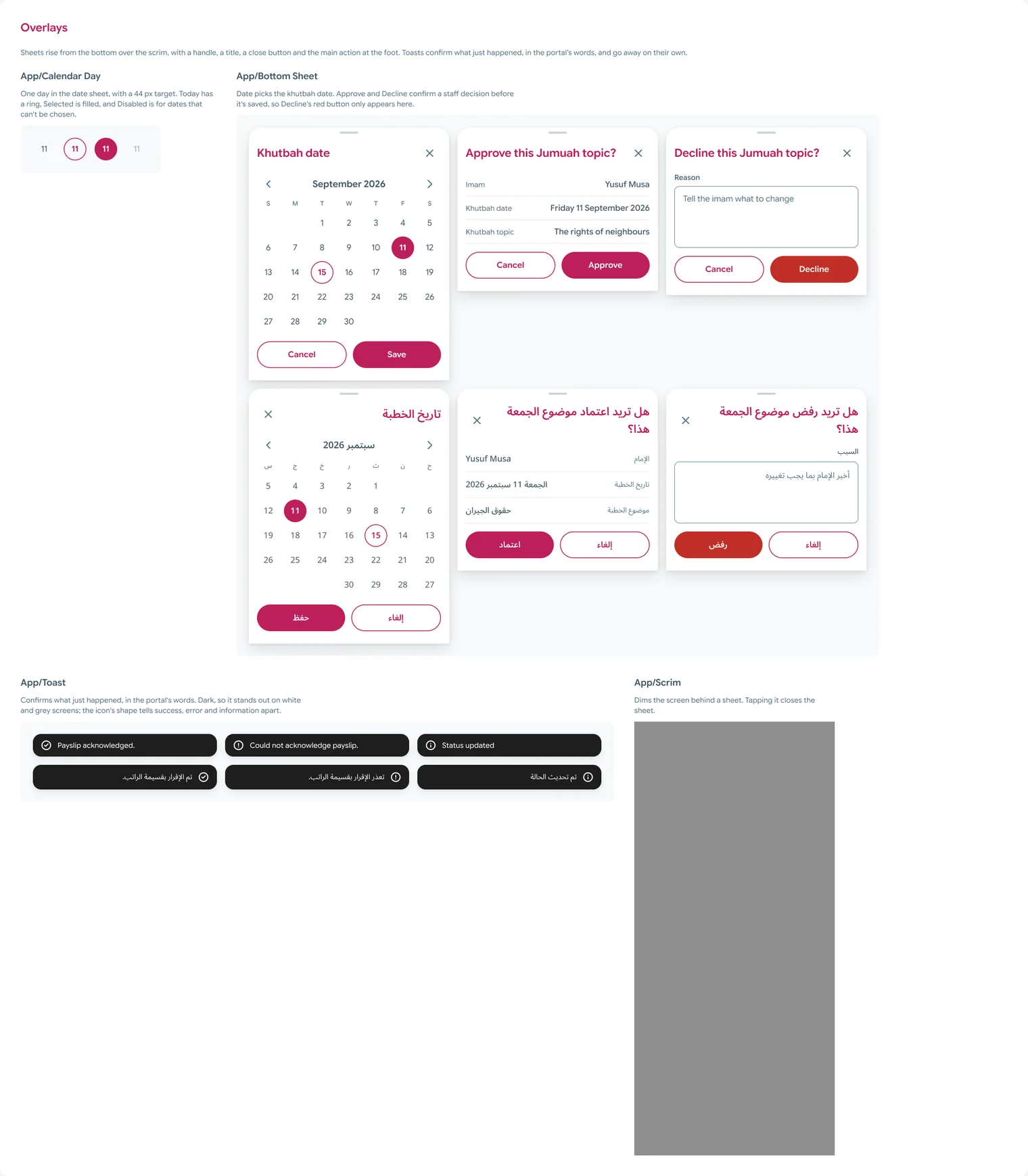
I prototyped three paths in Figma. In the first, an imam submits a Jumuah topic from the welcome screen all the way to the confirmation, then opens one submission that’s still pending and one that came back declined. In the second, a staff member opens an imam, reviews his submission, and either approves it or writes a reason and declines it. The third is the Home screen in Arabic, laid out right to left. Altogether that’s 220 links, and I checked that none of them are broken.
A Figma prototype can show each path, but it can’t show the two sides sharing anything. So for this page I built one path as a real app, using the tokens and components from the file. An imam sends a Jumuah topic, it shows up in the staff queue, staff approve it or decline it with a reason, and the answer comes back to the imam. If you switch roles under the phone at the top of this page, both sides are looking at the same data. It’s a demo I built for this page, and it’s separate from what the developers are building.
The last piece was the handoff. It lives as panels inside the Figma file and also as a thirteen page document with the same content. It tells the developers where to start, what’s in the file, how to read a screen, which parts are new work, what I still need from them, and where I used stand-ins or left gaps. It also covers the tokens, how to map them onto Bootstrap 5 through either Sass or CSS variables, and the handful of components that need more than a colour swap.
The developers are an outside team of one or two, and I worked with one of them directly. They got the Figma file with Dev Mode and the working slice in code, so a screen can be read two ways: the measurements and tokens in the file, and how it behaves in the slice.
Key decisions
Reskin the web app, don’t redesign it
What I choseI left it all alone and changed only the theme and the wording.
The developers are already on Bootstrap 5, so this way they get a theme to apply and they don’t have to change framework. Even the breakpoints stay the way Bootstrap ships them.
The web app’s structure is exactly what it was before. Fixing that is a later project, and I’d want research behind it first.
The imam sees where he stands
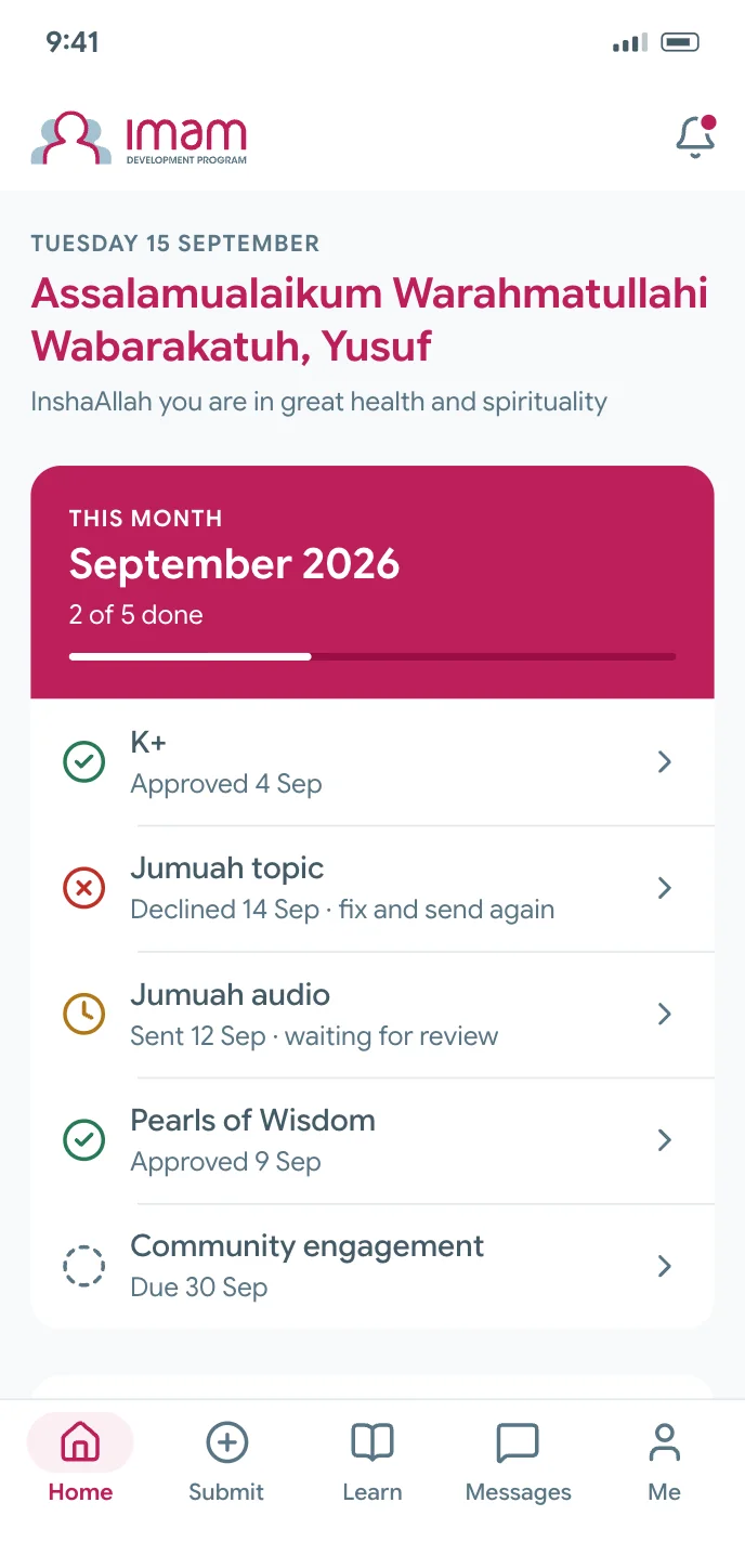
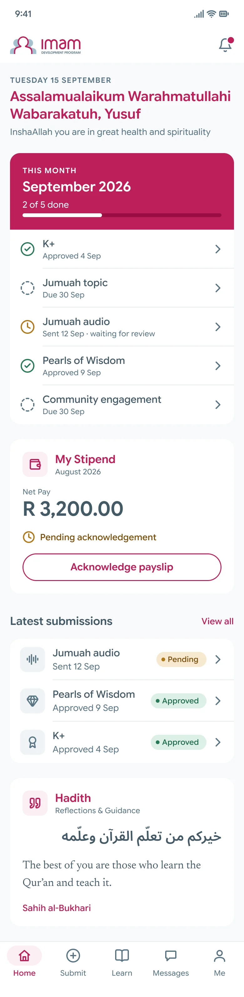
What I choseI added one card to the imam’s Home that puts K+, Community Engagement and Pearls of Wisdom together and shows how many he’s done this month.
The compliance report ties all three to the stipend, and until now an imam had no way to see where he stood.
This is new work and the portal has nothing like it today, so I listed it separately in the handoff and the developers can price it separately.
Staff get a queue
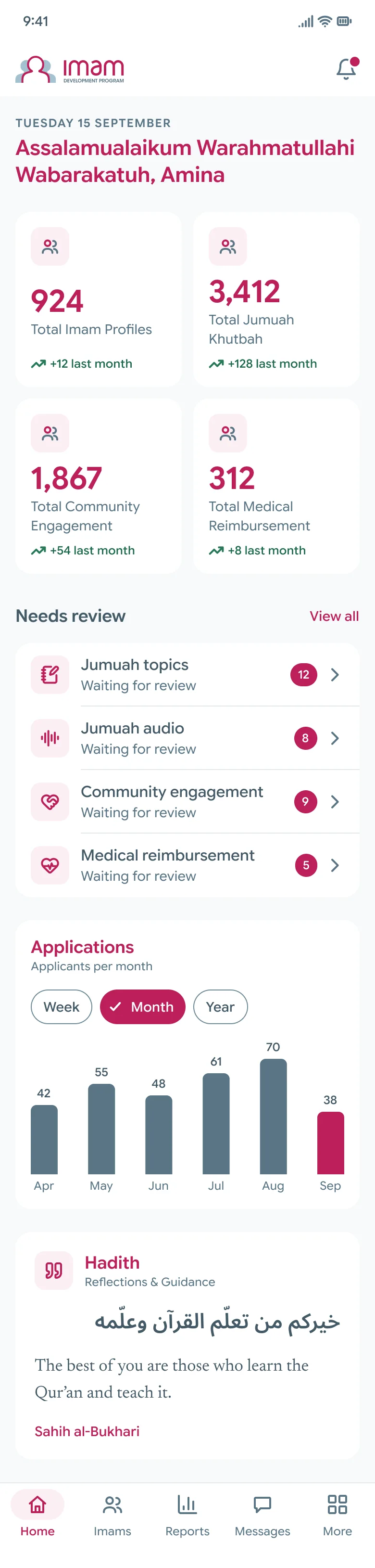
What I choseI put “Needs review” first, with each submission type and the number waiting next to it.
The data was already there, it just wasn’t shown this way. In the handoff I told the developers that of everything in the file, this is the piece that would save staff the most time.
Like the imam’s card, this is new work, so it’s on the separate list for pricing too.
Rows wrap, they never get cut off
What I choseEvery row wraps onto a second line if it needs to. The type and the components also carry right to left variants, even though the app is English only for now.
Swahili and Chichewa strings run about a third longer than English. I also asked the developers to use Bootstrap’s logical spacing utilities, so a right to left build later on doesn’t cost them anything extra.
Rows end up taller and screens a bit longer in English.
Say what I could not see
What I choseI marked them, both on the frame and in the handoff. Two reports came back with no columns at all, so I had to infer those two screens, and the handoff says they’re the two I’m least confident about. The payslip stays marked "to confirm" because nothing I could read explains how a package turns into the amount that’s actually paid.
I’d much rather a developer knows this on day one than finds out halfway through a build.
Anyone who opens the file can see exactly where the gaps are.
Three tokens are banned in the app
What I choseI fenced them off. Three tokens fail WCAG AA, which are text/muted, the warning foreground on its own tint, and icon/muted at 2.2 to 1 on white. The handoff names each one and tells the developers what to use in its place.
The website already uses these tokens and its stylesheet is generated from the shared pages, so the two systems have to stay in step for now.
The failing values are still sitting in the shared system until the website itself changes.
The work
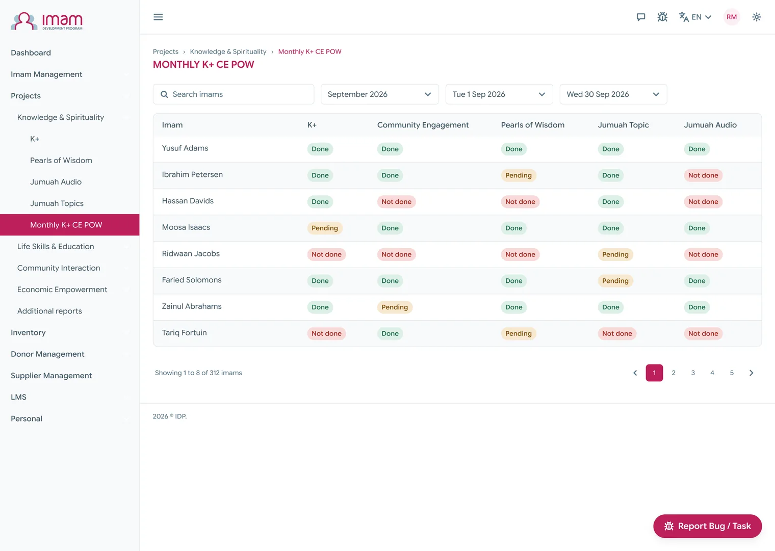
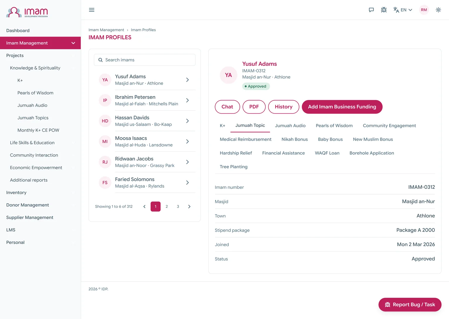
Here’s the web app first. It’s a dense product by nature, with a long navigation, tables that carry a status in every cell, and records that open beside their list.
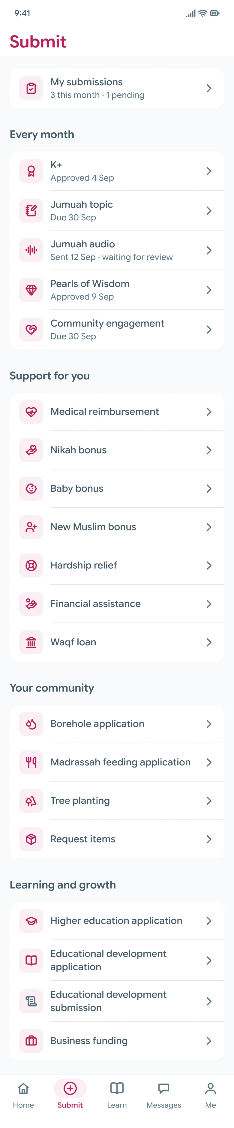
On the phone, the imam’s side comes first. The first thing Home tells him is where he stands this month, and the Submit tab holds every form the portal has, grouped by what each one is for.
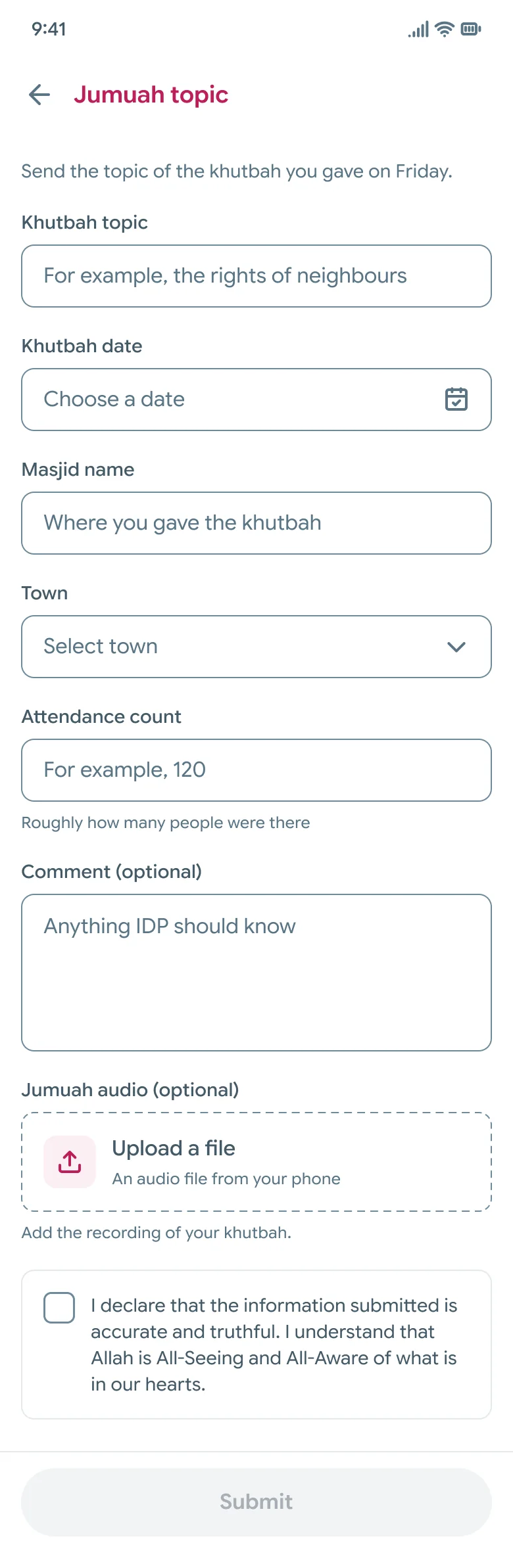
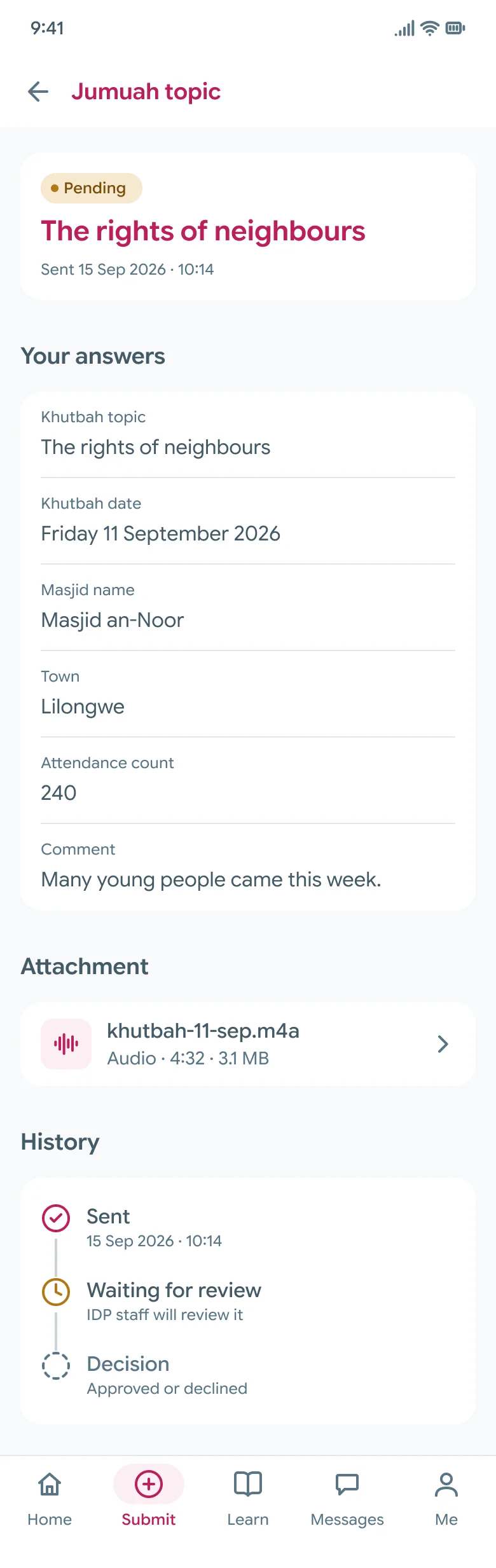
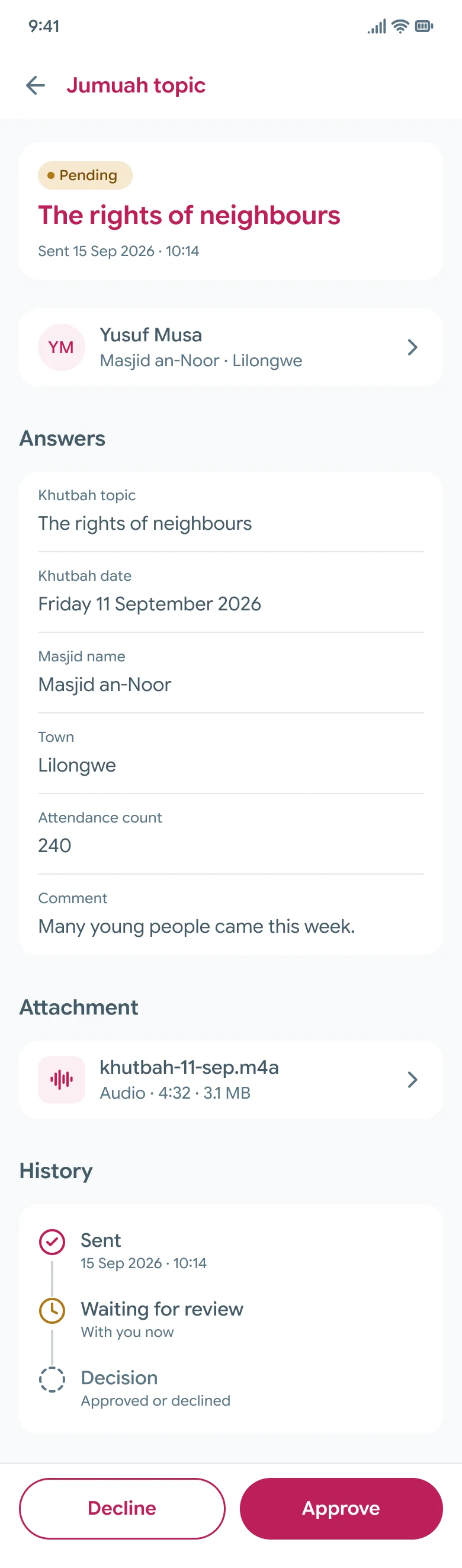
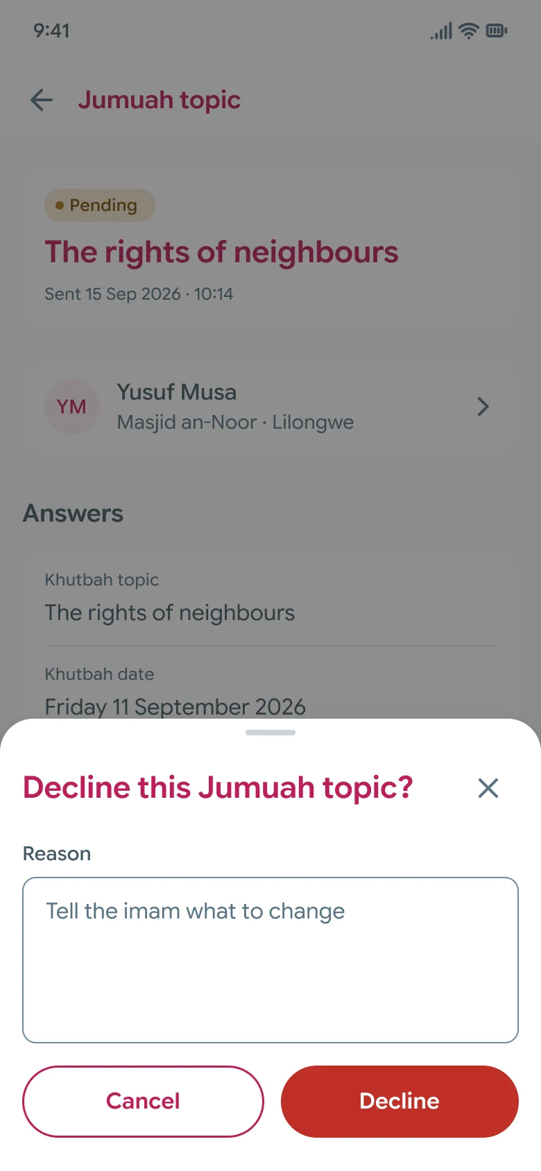
Staff use the same app with a different set of five tabs. They can review a submission and approve it, or decline it with a reason the imam can actually act on.
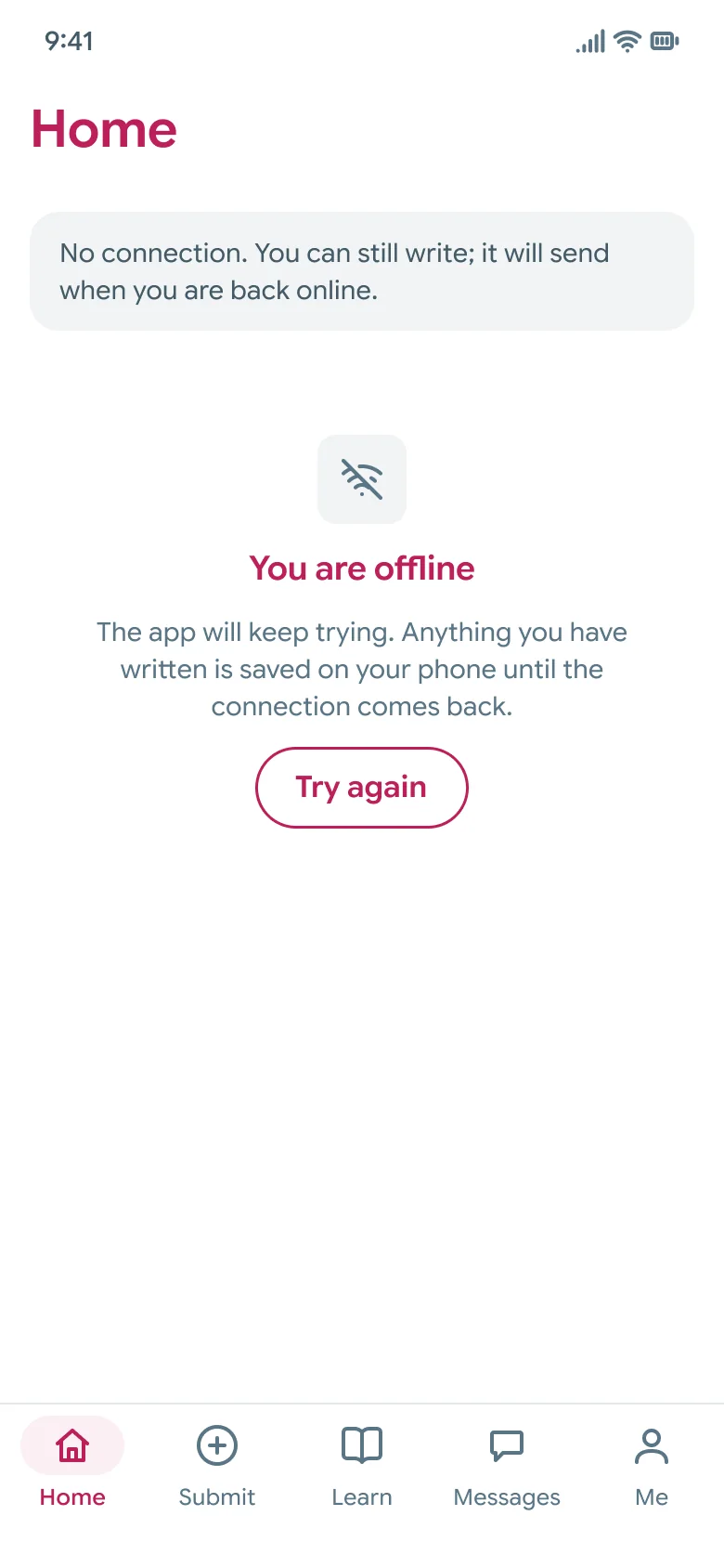
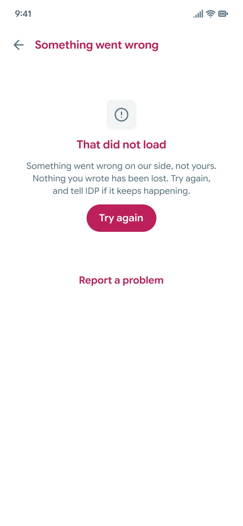
I drew the states once and reuse them everywhere. Offline, loading, empty, error and no access are five screens in their own section of the file. The Arabic Home screen is the pilot for right to left.
And this is the system underneath all of it.
Anything in here you disagree with, tell me. I would much rather redraw a screen now than have you build around a guess of mine.
Evidence
- The file has 68 phone screens in twelve sections and 15 web templates.
- The app library has 28 component sets, 188 variants and 76 icons.
- The Figma prototype has 220 links and none of them are broken.
- The tokens come in three layers (primitives, semantic and app). I exported them as CSS custom properties and as JSON, along with a Bootstrap 5 map that works through either Sass or CSS variables.
- I named the 3 tokens that fail WCAG AA and gave a replacement for each. I also flagged 2 tap targets that sit under 44 pixels, with the tap area they need in code.
- The handoff lists 6 pieces of new work so they can be priced separately, asks the developers 7 questions, and declares 4 stand-ins.
- The working slice on this page passes 137 scripted checks, and an axe accessibility run across 35 screens and states found no violations. I ran both on my machine on 17 September 2026.
- Every name, masjid, number and date in the designs is made up. No real imam appears anywhere.
There are no usage numbers or test results here, because it hasn’t been built yet and I haven’t tested it with imams.
Result
I designed and prototyped this from July 2026 and handed it to the developers in September 2026, and they’re building it now.
For tools, I used Figma variables, Dev Mode and Figma prototyping, and I exported the tokens as CSS and JSON with a Bootstrap 5 map.
How I used AI. I used AI to help me build the component sets and the foundations pages in Figma. The working slice at the top of this page was built in code with Claude Code, working from my Figma file.
What I'd change next
First I’d test the phone app with imams and staff before it gets built, starting with the two reports I had to infer. I’d also get an imam login and a staff login so I can check the thirty five closed routes against the real thing. The K+ test needs a choice row, and I want to add that to the design system properly. After all that, I’d come back to the web app’s structure, which I left alone on purpose.