INFORMATION ARCHITECTURE
Rebuilding Tesla Canada's navigation
100%
Found Support on first click (n=5)
4
Core navigation changes proposed
80%
Task success across all three scenarios
Overview
Tesla's website looks beautiful, but its minimalism comes at a cost. As a team of four for our Information Architecture course, we audited the Canadian site and found the navigation was actively making things hard to find. So we rebuilt the structure — and tested whether our version actually worked better.
My part: I built the working prototype the whole team tested on, and I owned two of the IA changes — adding the floating "Ask a Question" chat, and moving the cluttered "Discover" links down into the footer.
The challenge
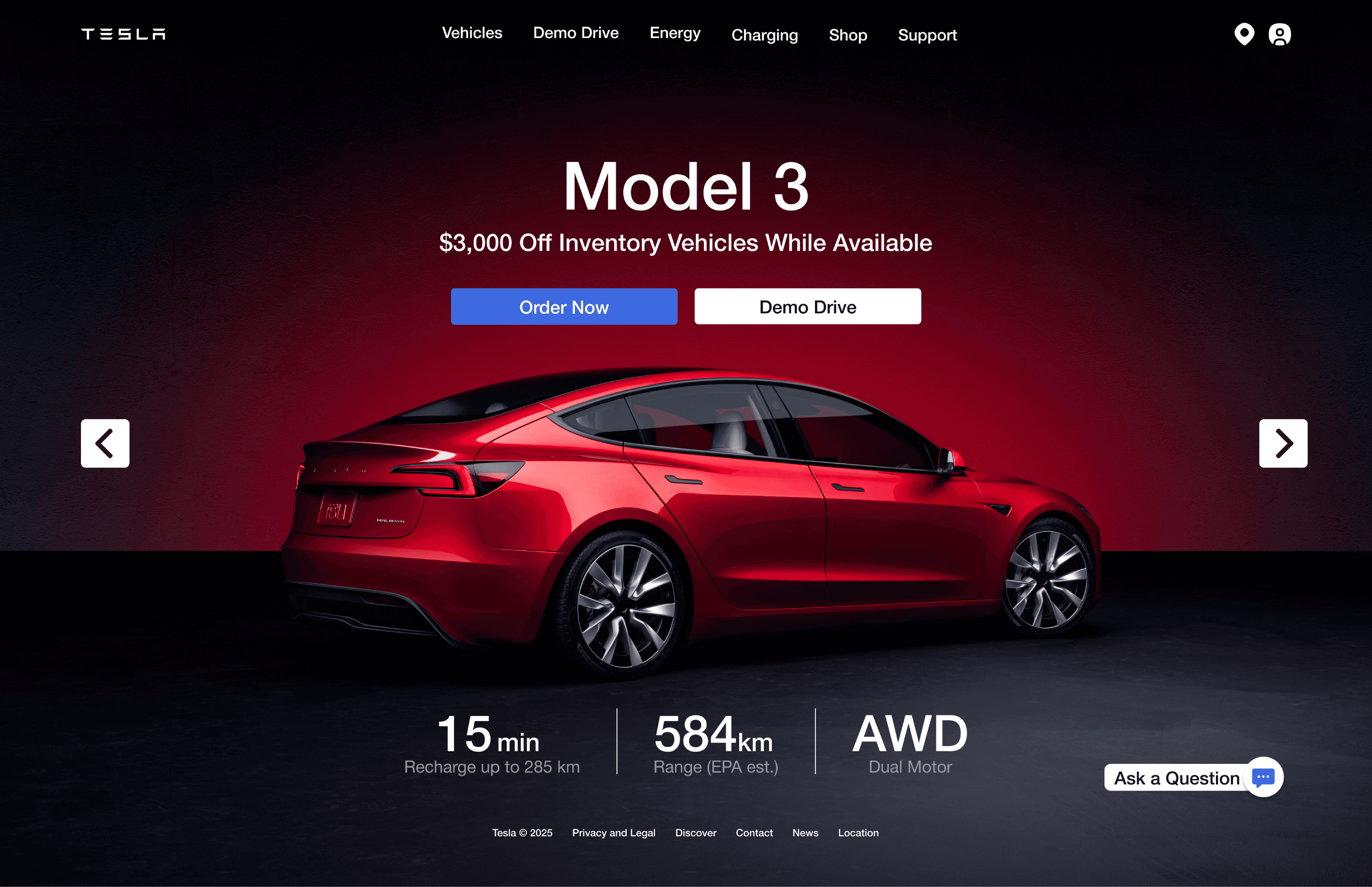
Tesla's nav has the opposite problem of most sites: it's too minimal. A few findings from the audit:
"Support" was buried and duplicated. The one link people need in a crisis was tucked into the utility nav and scattered across Energy, Charging and Support — never where you'd look first.
Demo Drive was repeated everywhere. The same link showed up redundantly under every single vehicle, instead of once at the top.
Minimalism hid the basics. Icons without labels and big image-led pages meant people had to guess, and click several layers deep just to find specs or a warranty.
Minimalism is supposed to reduce clutter. Here it was hiding the things people actually came for — which raises cognitive load and quietly chips away at trust on a page where someone's deciding whether to spend $50,000.
The old structure, mapped
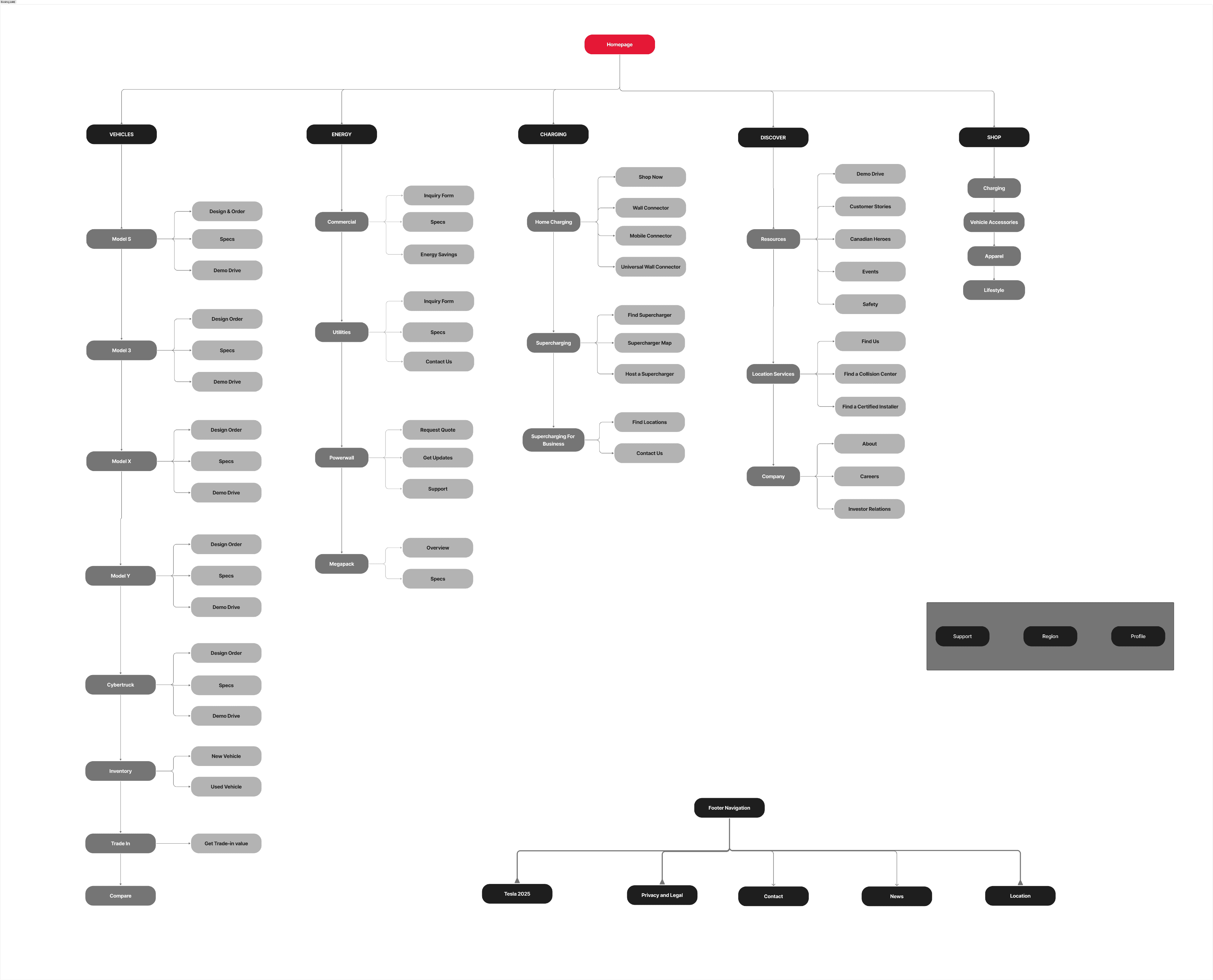
Before changing anything, we mapped the entire existing site into one tree. Seeing it all at once made the problems obvious: Support living in three different branches, Demo Drive duplicated under every vehicle, and a top-heavy "Discover" section competing with the actual buy-a-car journey. You can't fix an IA you haven't drawn.
Support, promoted to the top
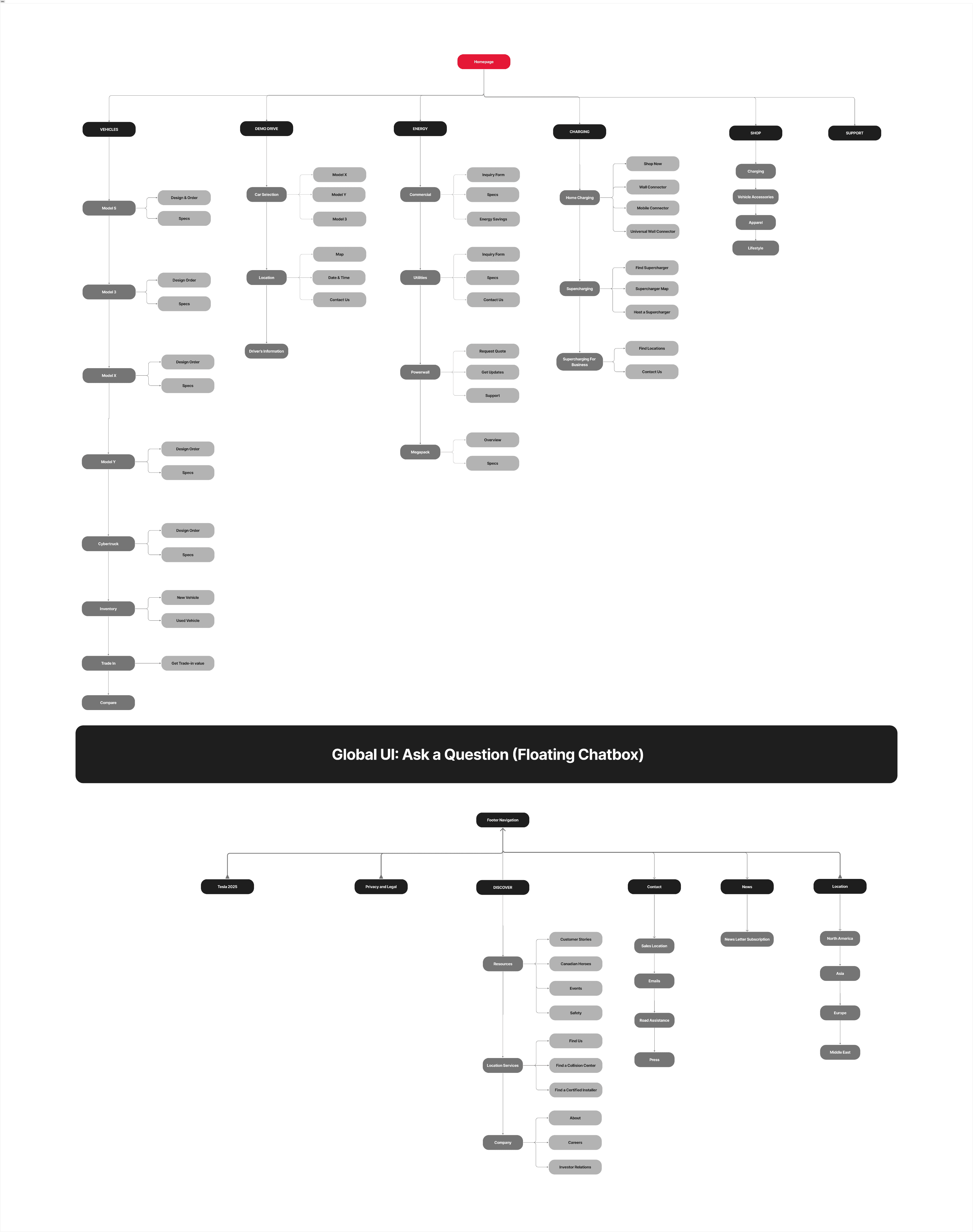
The biggest move: we pulled "Support" out of the buried utility nav and put it in the main header, and removed the duplicate copies. One obvious home for help, visible from anywhere. (When we tested this, 5 out of 5 people went straight to it — more on that below.)
A floating "Ask a Question" chat
This was one of my pieces. I added a persistent floating chat button in the bottom-right corner — the spot people already expect support to live, based on a competitive scan of other automotive sites. The idea: instant help without digging through any menu, which should cut the number of people who give up and leave.
A lighter top nav, a fuller footer
My other piece: I moved the "Discover" links — Careers, Customer Stories, Events, and the location/company stuff — out of the top nav and down into the footer. They matter, but they're secondary to actually buying or test-driving a car. Demoting them cleaned up the header so it points at products and purchasing, while the footer became the natural home for that browse-y content.
How we tested it
We didn't just argue our version was better — we checked. Three rounds, all on the prototype I built:
First-click test — "You have an app issue, where do you click?" 5 out of 5 went to the new Support link.
Five-second test — we flashed the homepage for five seconds, hid it, then asked if they'd noticed any way to get quick help. 5 out of 5 remembered the floating chat.
Task-based usability test — three real scenarios: book a test drive, report a broken touchscreen, and find emergency help.
The results
Task | Success (n=5) | Avg. time | Takeaway |
|---|---|---|---|
Book a test drive | 80% | ~15s | The central CTA works — people found it fast. |
Touchscreen issue | 80% | ~35s | Strong link in people's minds between "broken screen" and the Support menu. |
Find immediate help | 80% | ~20s | The floating chat worked — but some older participants didn't notice it (banner blindness). |
What we'd do next
The structure validated well, but the testing pointed at clear next steps:
Keep Support in the global nav, but also add it on individual vehicle pages — some people browsing a specific car looked for help there.
Make the floating chat harder to miss. Since older participants overlooked it, a subtle pulse after a few idle seconds could fix the "banner blindness" without ruining the minimal look.
Test with more than five people. Five is enough to surface big problems, not enough to trust the percentages — a bigger round would firm up the numbers.
portfolio
Other projects
Check out some of my other work